"What ways do your products use/develop/challenge forms & conventions of Real Media Products?"
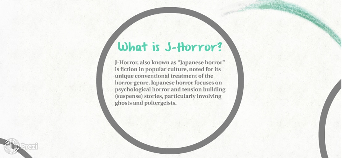
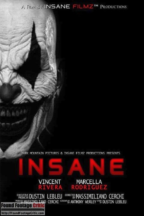
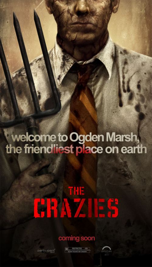
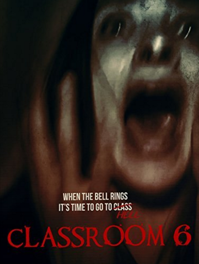
In this section, we will be comparing our final projects with real media text that exist in this horror genre. By comparing the two it will help us to see how successful our film teaser trailer, poster and magazine would be in the real world, and how much it will catch the audience’s eyes. Throughout this section we will be discussing which conventions we followed, changed around and developed into our own style, and which conventions we found difficult to do and how we overcame this. Forms & Conventions of Real Media Products are rules that make a trailer a trailer and a movie poster a movie poster. Conventions help an audience recognize what type of media product it is by genre and whether they will choose to consume it or not.
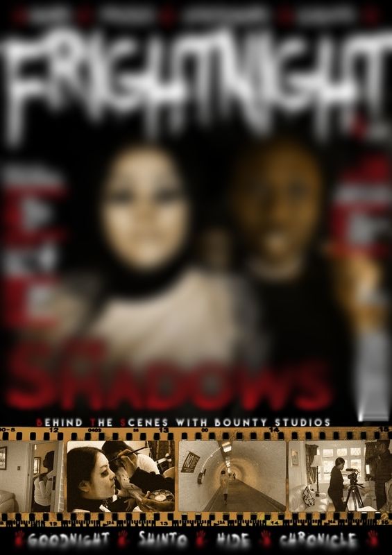
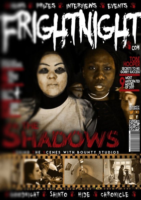
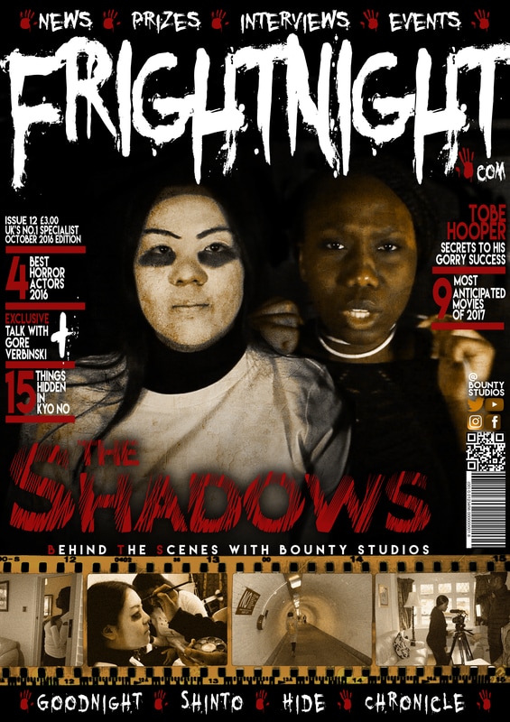
Our Final Pieces
Poster |
Magazine |

|

|
Trailer
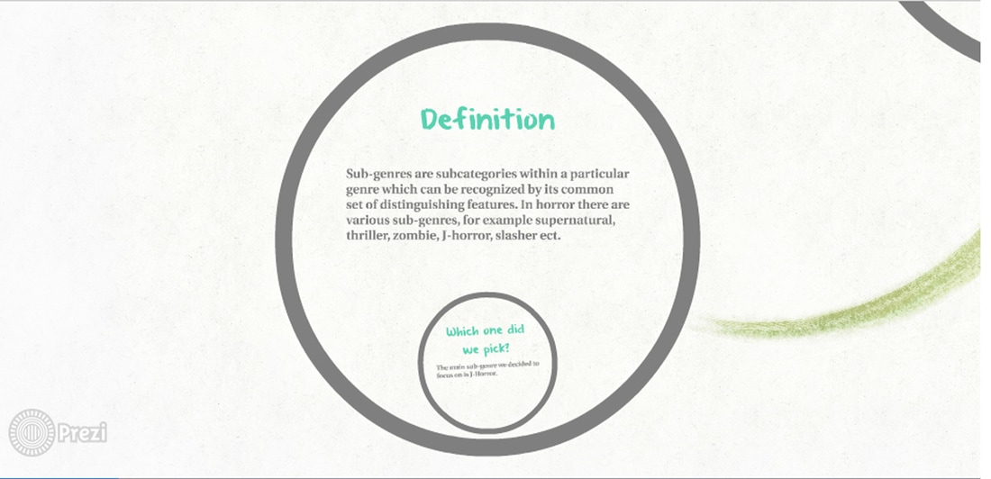
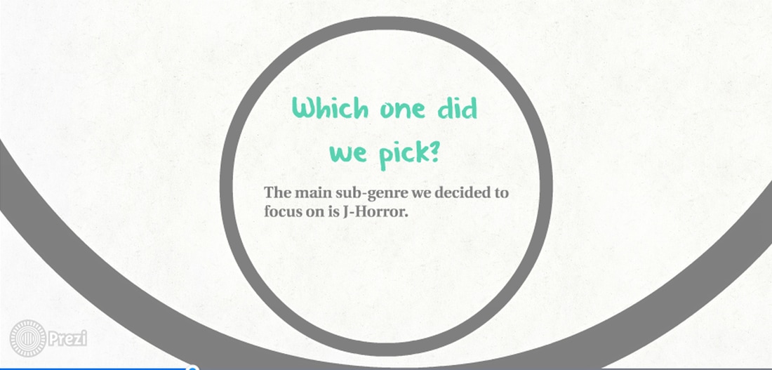
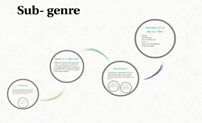
Sub-genre:
|
|
|
|
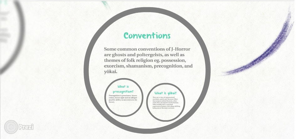
Conventions:
In this section we will be displaying real media texts in relation to our own trailer, movie and poster in order to see how accurate we have made them in comparison and what specific conventions we have followed, challenged and developed while making our final pieces.
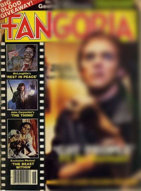
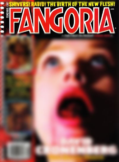
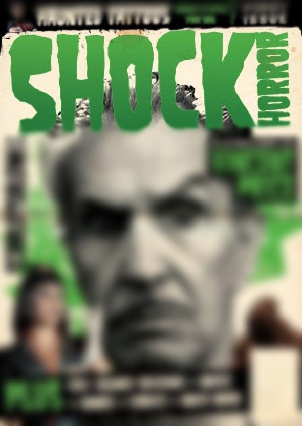
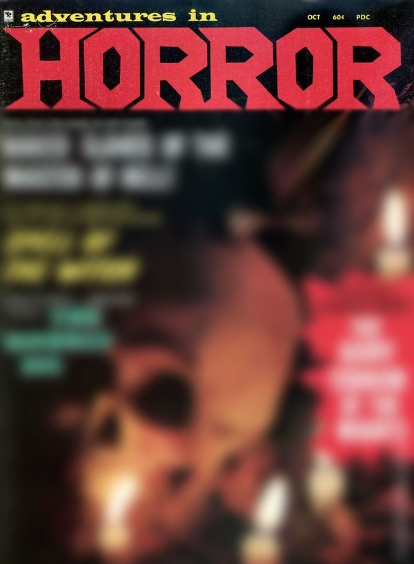
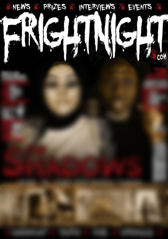
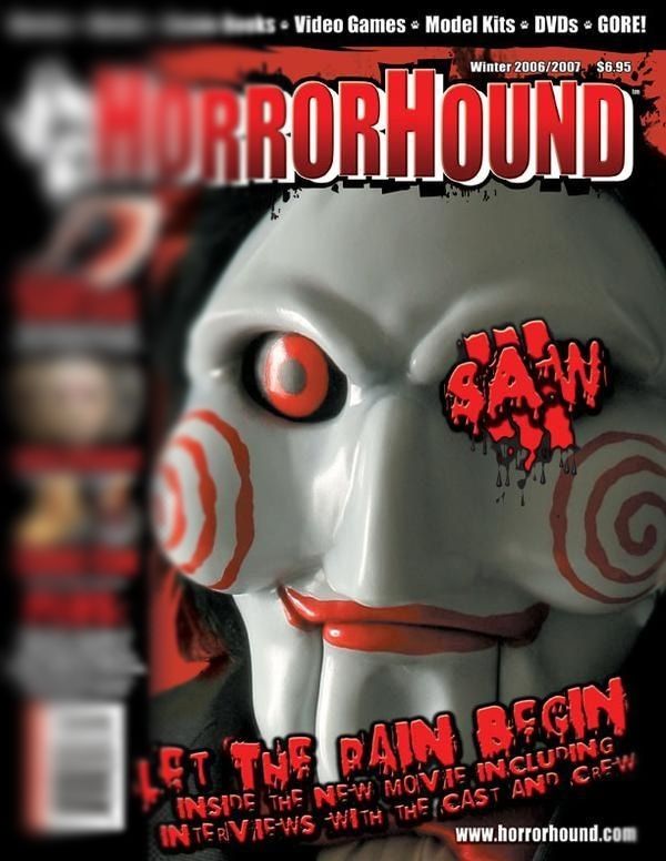
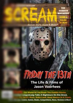
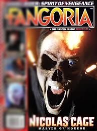
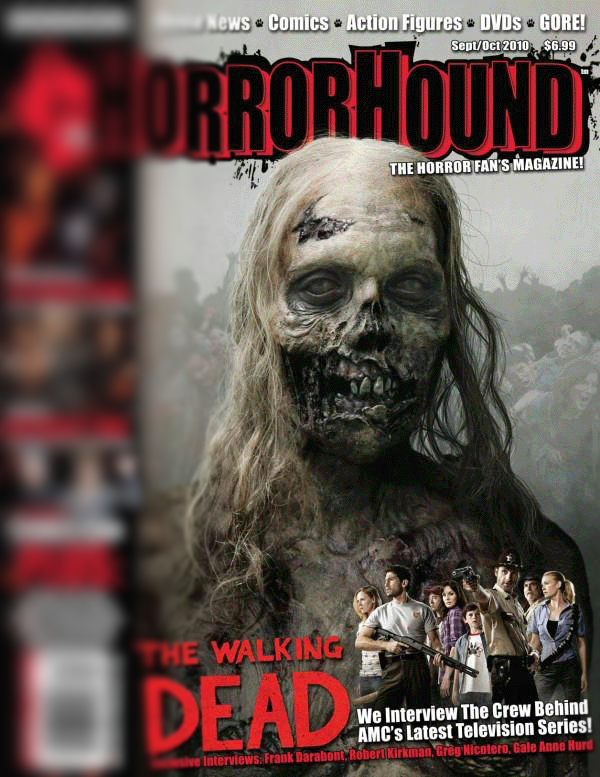
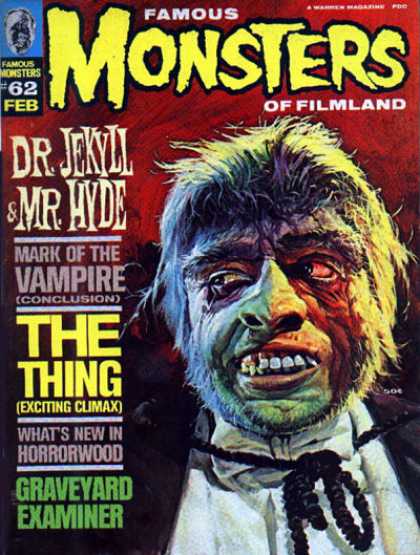
Magazine Conventions:
|
|
|
|
Magazine Conventions We Followed:
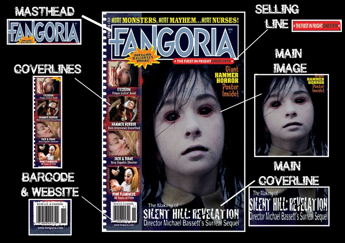
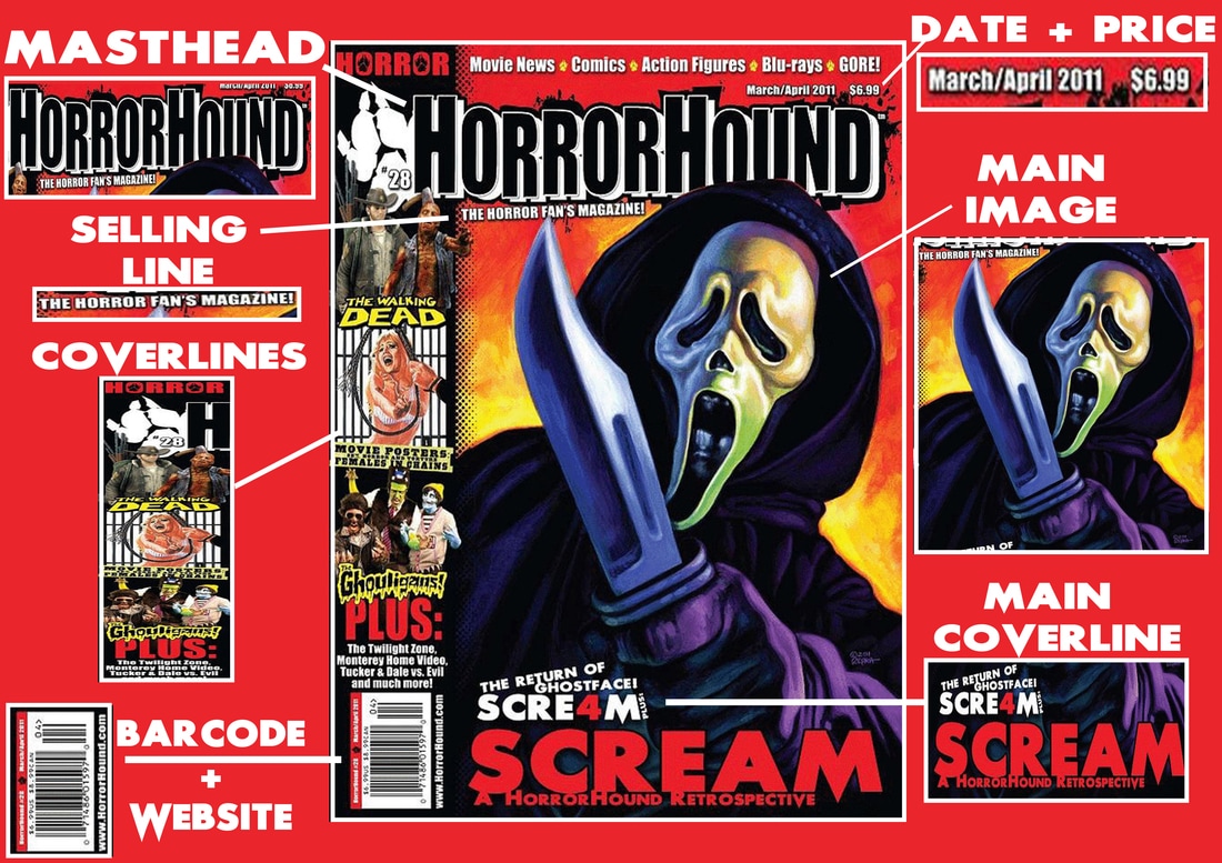
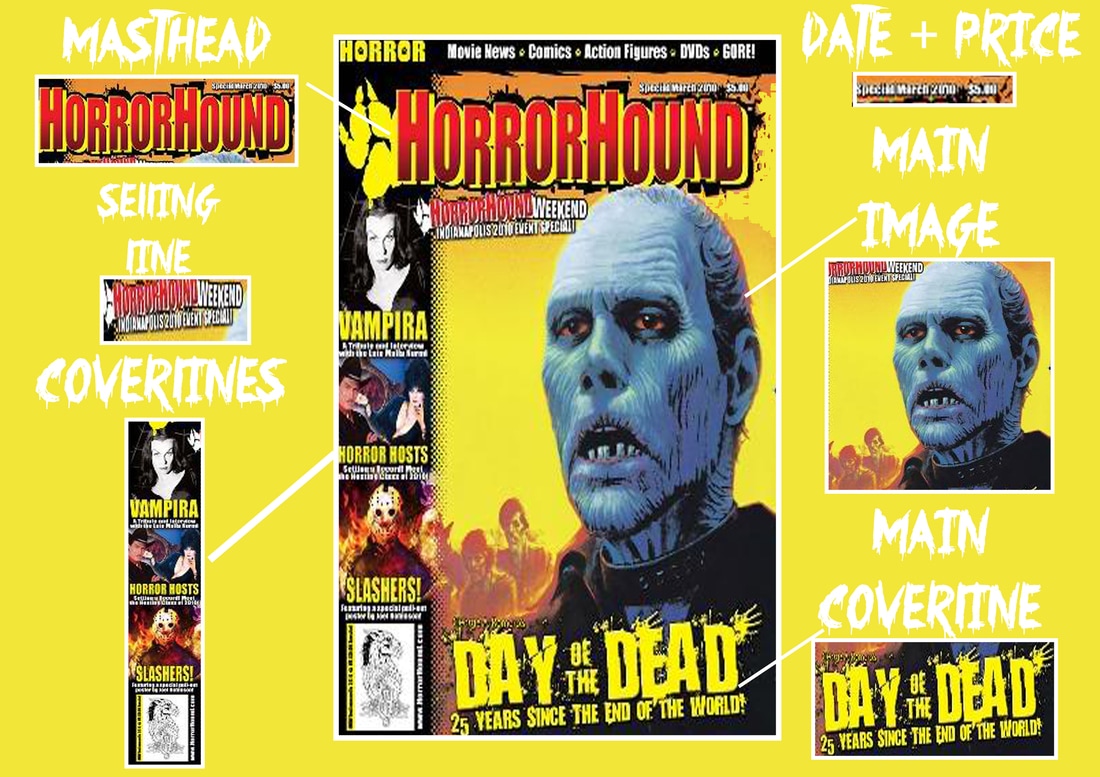
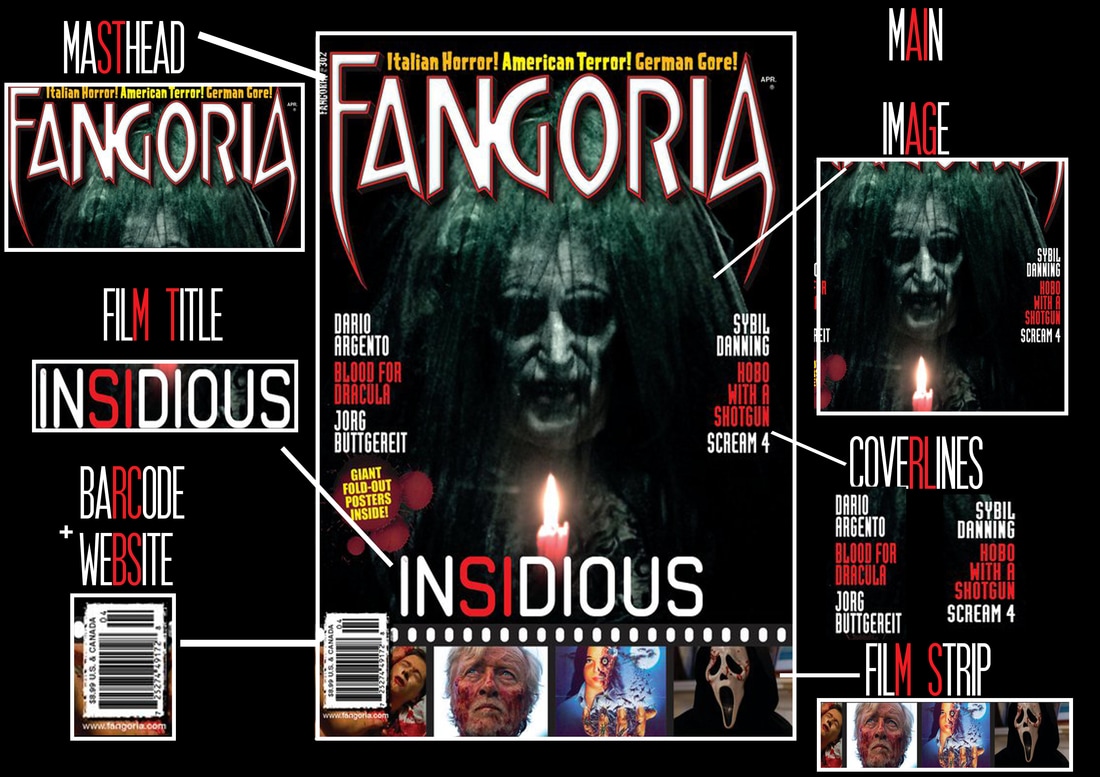
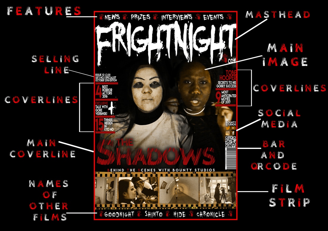
Film Strip
|
|
|
|
|
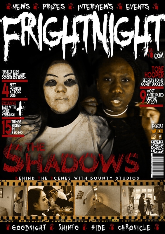
A film strip is a very useful and sufficient way to show the readers what goes on behind the scenes and any additional features that were put into this magazine. This makes the magazine have an old vintage feel to it as it also makes it look more creative.
Bold Masthead
|
|
|
|
|
The use of a bold masthead makes the magazine stand out more due to the fact that it will catch the readers attention straight away. It will also keep our magazine in the readers mind and they will continuously be looking out for new additions that we bring out every month.
Main Image In The Middle
|
|
|
|
|
By having our image in the middle of our two main characters, it helps create a sense of continuity from the magazine to the poster and trailer so that our readers know that they can find additional things about our projects in the magazine.
Magazine Conventions We Developed:
Coverlines
|
|
|
|

|
We decided to develop our cover-lines by displaying them at the sides of our magazine, instead of all at the bottom or just on one side. We decided to separate them by using a line inbetween the different subjects making it easier for our readers to read.
Features
|
|
|
|
|
Another convention we decided to develop is the features eg. "News. Prizes. Interviews. Events" ect. We developed this by also having sme other features at the bottom of our magazine which displays other horror film titles. This shows that a variety of things are in this issue of our magazine.
Magazine Conventions We Challenged:
Barcodes

|
|
|
|
|
One convention we challenged was changing the layout for the barcode area. We decided instead of following the left third convention of having a barcode in the bottom left corner, we paced it on the right hand side on top of our film strip. In addition to this we also added a QR code so that people can access our magazine from their smart phone if they would prefer to, and we also included our social media information if any readers would like to interact with us and see more information on our social media sites.
Having One Main Image On The Frontpage
|
|
|
|

|
Instead of having one main person in the centre of our magazine, we decided to have two people for our main image. This is because it helps provide a sense of continuity between our magazine, poster and trailer because these two are our main characters. Therefore the readers would be able to remember them easier if they look at our other content, this also helps tell part of the story because our readers will question why is she sitting next to her and what is going on, due to one of our characters having something around their neck.
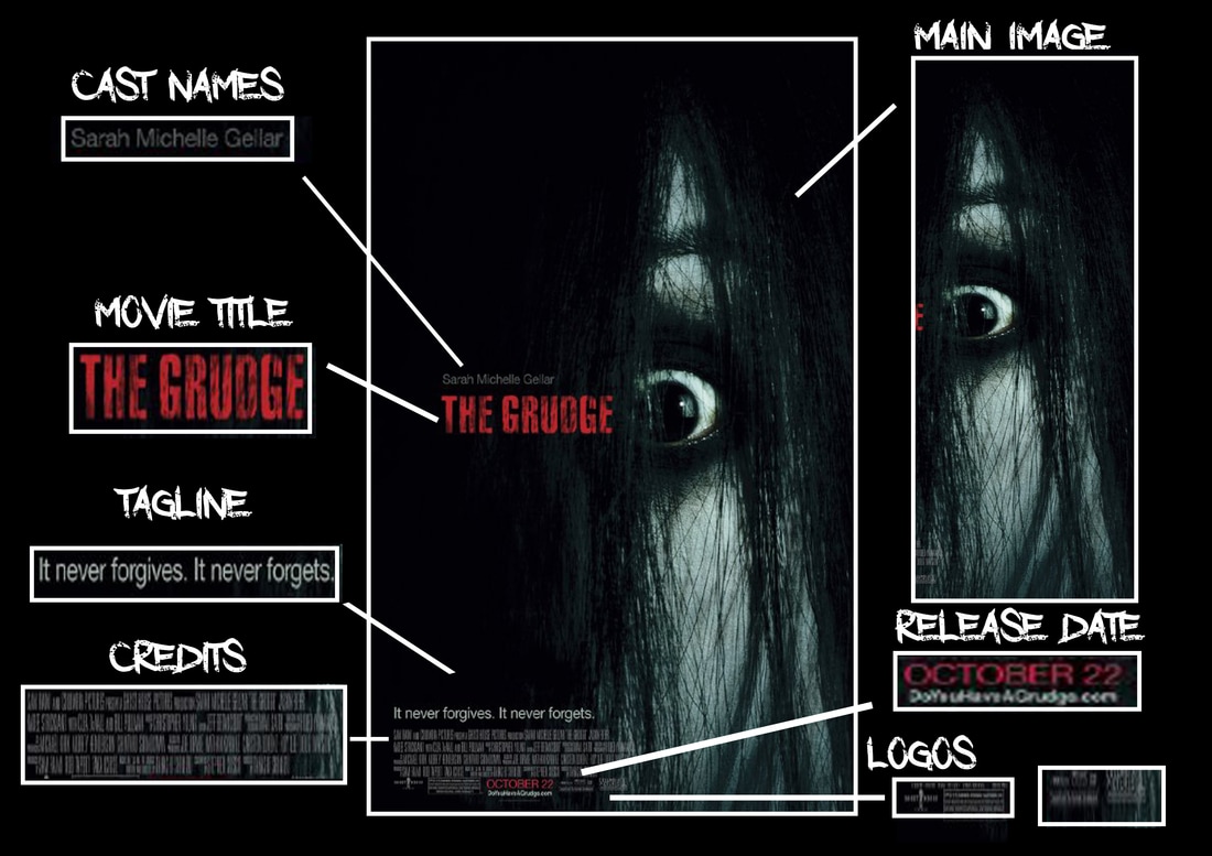
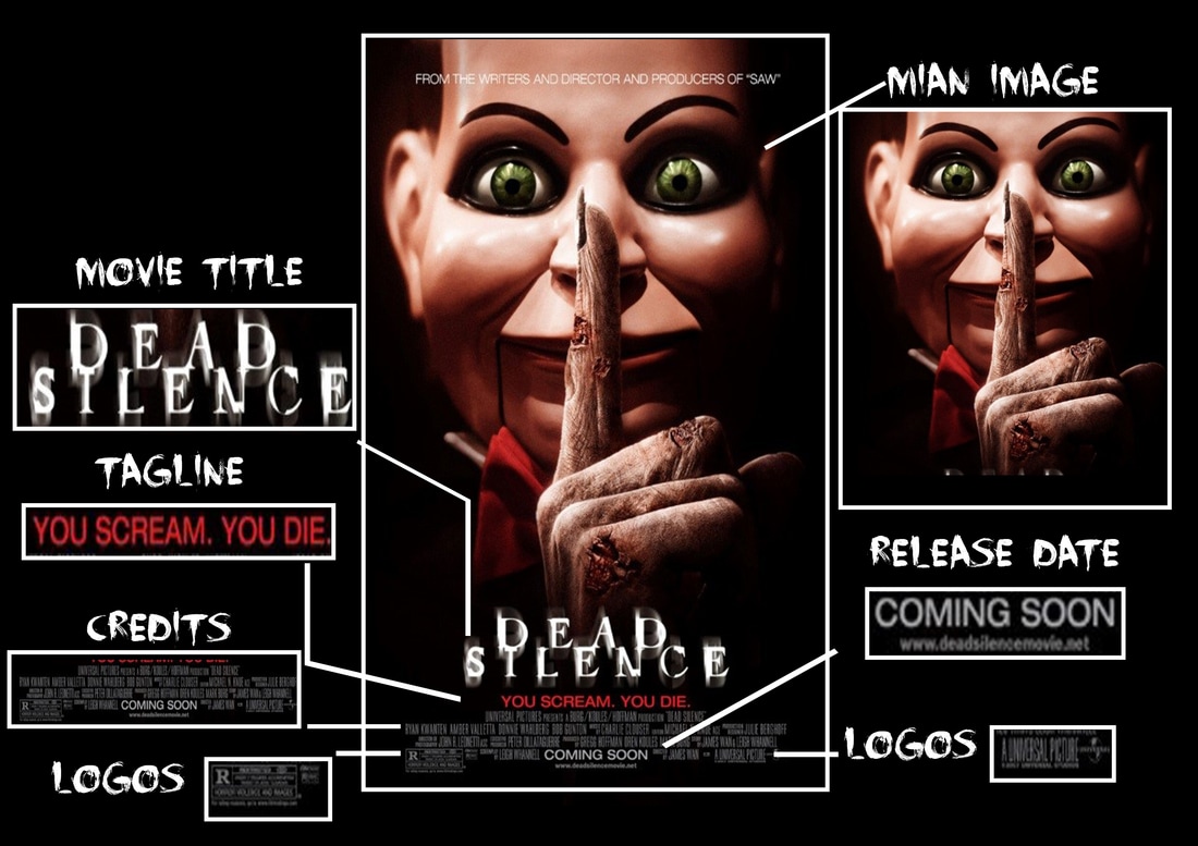
Poster Conventions:
|
|
Poster Conventions We Followed:
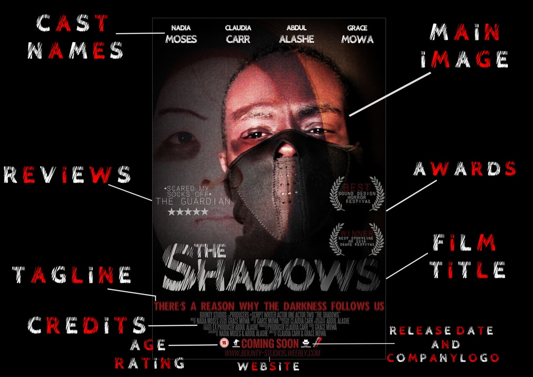
Close Ups
|
|
|
|
|
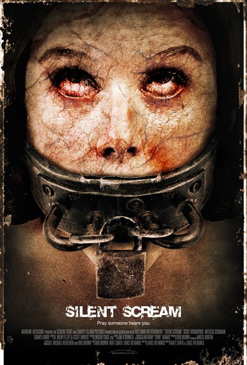
One convention we followed was having a close up of a character, usually it is just the antagonist and/or protagonist who is in the close up but we decided to add one of our stock characters and our protagonist in order to make the audience guess what relation they would have to each other.
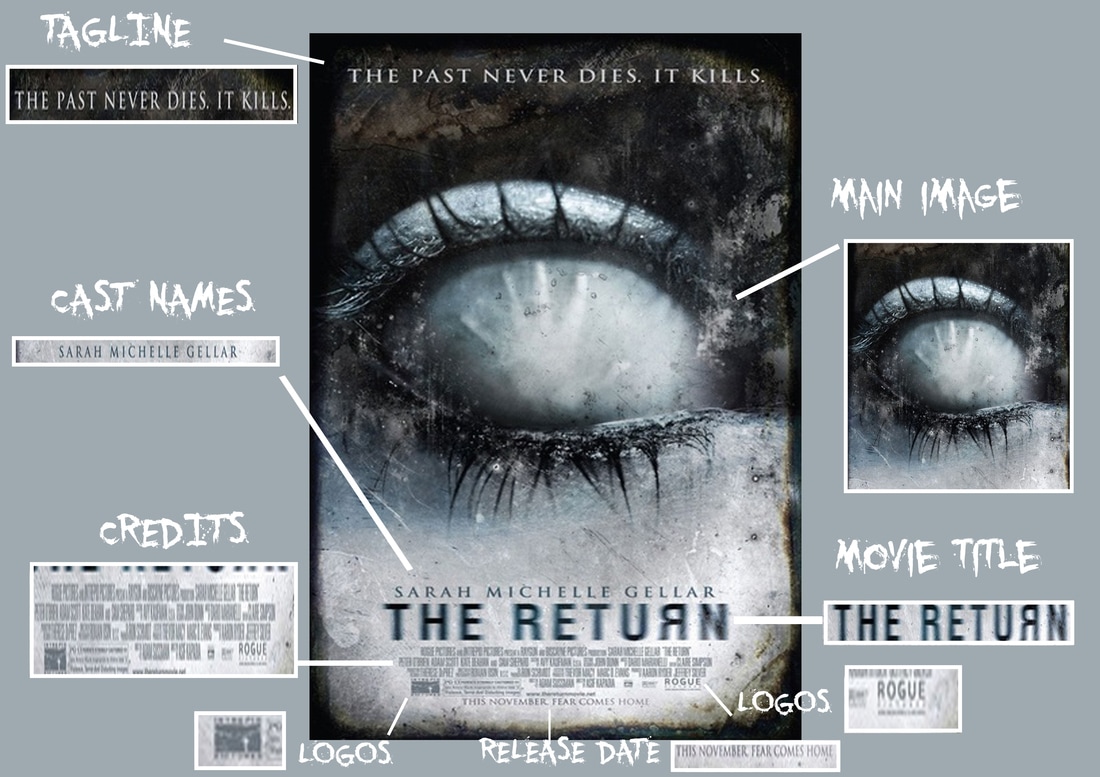
Film Title At The Bottom
|
|
|
|

|
We followed the film title convention because it doesn't distract our audience from the main image, and the cast names that are at the top. This makes our poster look more structured and also helps our audience see how the tagline (under) relates to the title.
Credits At The Bottom
|
|
|
|

|
Another convention we followed was the credits. We thought it was best to imitate where the credits are displayed on previous posters because likewise with the title it helps make our poster look more structured, also by writing them in a small font, it doesn't distract our readers.
Background Picture
|
|
|
|

|
We added a faded background image so that our protagonist is "haunting" one of our stock characters. We decided to do this because it adds to the storyline as our audience will think what happens to him and if he and the other characters make it out alive.
Poster Conventions We Developed:
No Background Location
|
|
|
|

|
By having no background image, it helps create a sense of mystery as our audience will wonder where this film it set and what is going to happen. We developed this by instead of just having one image of our stock character, we added an image of our protagonist behind him in order to help hide the background even more.
Release Date
|
|
|
|

|
Although we followed the convention of having release information, we developed this by instead of having a set date or a set month, we just wrote "Coming Soon" so it creates suspense and leaves our audience wondering when our film is going to come out. This is beneficial because people will keep an eye out for any new information and would constantly check our social media sites.
Poster Conventions We Challenged:
Cast Names At The Top
|
|
|
|

|
One thing we noticed is that most posters have their tagline or nothing at the top of their poster, so we decided to challenge this by putting our cast names at the top of our own poster so that there wasn't any gaps and our audience will know who the main people are that made the film, which could potentially make them want to go on to see if we have any other work.
Awards
|
|
|
|

|
From previous horror posters we saw online, we realised hardly any of them had awards on their poster. So we decided to challenge this and add two awards on the right hand side of our poster, we deiced to do this because it would make our work look more appealing and when people see that we have won awards for this film it will make them want to watch it even more to see if it was worth winning.
Reviews
|
|
|
|

|
Likewise with awards, we noticed that not many posters have reviews in them in regards to what people thought about the film. As a result of this we added one review on the left hand side, we decided to choose The Guardian because they are very well known and many people value their opinions when they review things, so by having a five star review from them it will help boost our film even more.
Colour Of Film Title
|
|
|
|

|
With the main coverlines, we observed that most of them are in red to connote the colour of blood and danger, as a result of this we decided to put our film title in white / grey to make it look different and stand out more. Also, this would make our poster seem different from the norm because our audience will wonder if there is going to be any blood/danger in our film.
Trailer Conventions
Trailer Conventions We Followed:
Production Team Company Logo At The Start
In most films no matter what the genre is mainly starts with a logo, we decided to follow this convention because before any action starts our audience will know which company made this film, and if they enjoy the trailer they will watch any other things we put out. Also it helps our trailer to look more structured as it may not be suitable to have it at the end.
Film Title
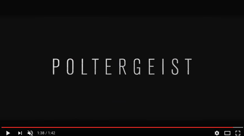
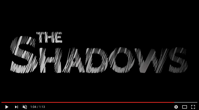
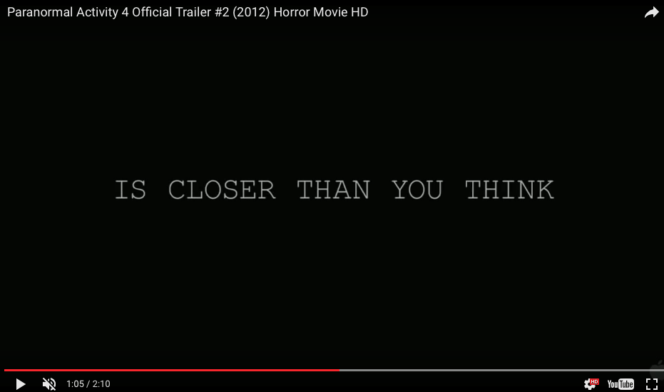
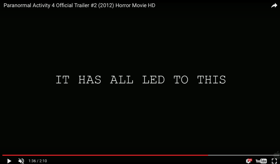
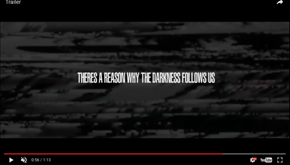
Most films have their title somewhere in their trailer so the audience knows what the name is of the trailer they are watching, The use of a black background on both gives a sense of mystery as the audience will wonder what happens in the film due to the fact that typography can sometimes give away what the storyline may be about.
Film Certificate
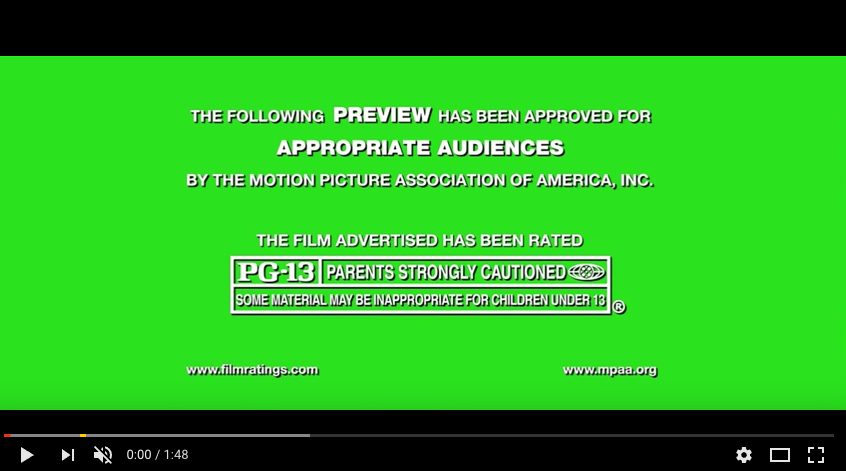
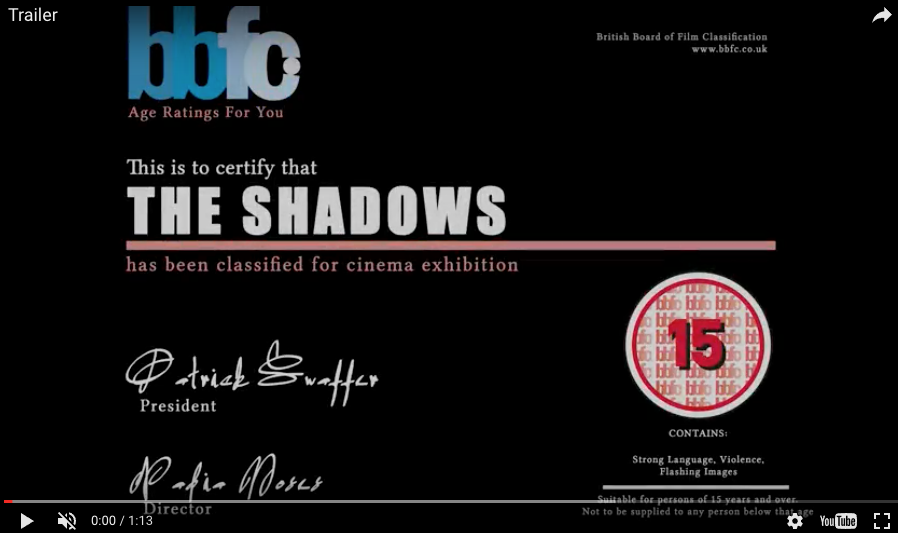
We believe that it is very useful to have the film certificate at the very start of our trailer, because it helps our audience to decide if they wish to carry on watching this due to some of the scenes that appear may not be suitable for them to watch or they wouldn't feel comfortable watching. Also by having this, it makes it easier for people who are not sure about watching it that they have to be over 15 to consider it first.
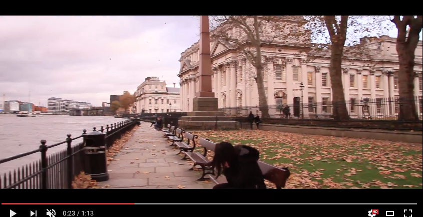
Wide Angle Shot At The Start
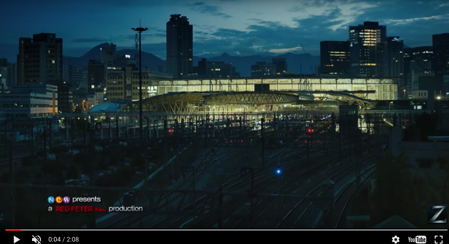
By having a wide angle shot at the start of our trailer, it is beneficial because it sets the mood of our trailer and for the first time, our audience will get an idea of where our trailer was filmed and what it will be about. Seeing as it starts with an everyday place (the train station) our audience will already start to have questions in their mind as to what could possibly happen here.
Trailer Conventions We Developed:
Location
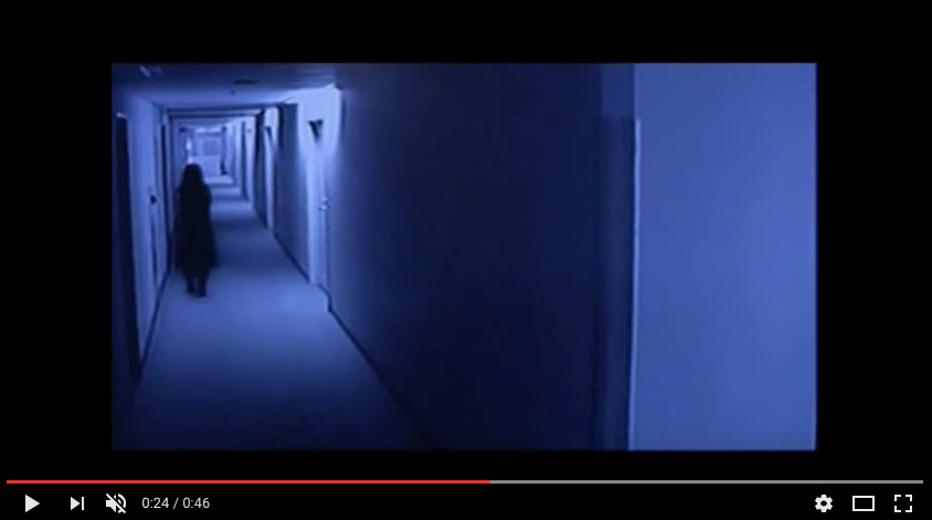
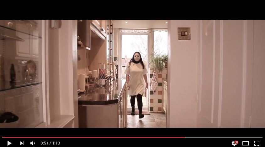
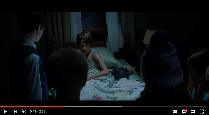
A common convention in these type of films is the ghost or possessed person walking through a long corridor in order to get to someone they are trying to attack. We decided to develop this by having Yuri walk through the kitchen in Mei's house in order to make it more realistic and she would be inside of her house without Mei even knowing, making the audience wonder if she was able to find her or was she able to escape.
Credits
One convention we developed is the end credits, most films only have the date the film is coming out and it's website / social media. We decided to include the credits, production teams and age rating (again) as well as a hashtag so that people know that they can get information about our website from online and also if they want to know everyone involved in the making of the film they would easily be able to see who done what.
Captions
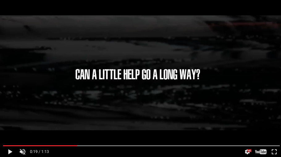
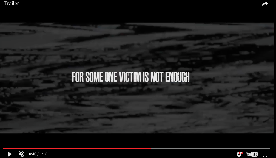
The use of captions help tell the story in the trailer because it fills in little gaps and gives clues to the audience about what is going to happen. We developed this convention by adding a background glitch effect on all 3 of our captions in order to create a sense of distortion to our audience, which may make them feel uneasy or weary about what is going to happen in the next scene.
Time Of Day
We decided to film our trailer in broad daylight / early evening instead of all at night or all in the morning. We decided to do this because it creates a sense of normality and would make our audience realise anything could happen in a normal day. Also by having our trailer being filmed in daylight / early evening makes the film more relatable to the audience because everyone goes out at this time.
Trailer Conventions We Challenged:
Length Of Trailer


Most trailers tend to be 2 minutes and a few seconds, however with our trailer we narrowed it down so that our trailer is only one minute and a few seconds. We decided to do this because the longer a trailer is, the more that it will reveal and we didn't want to give too much away due to the fact that this is only a teaser trailer, so we wanted to keep our audience wondering.
Release Date


We challenged the release date for our trailer because we wanted to keep the audience guessing when our trailer will come out. We realized most trailers have an exact release date, or they would put the month / season that the film is coming out, however we decided not to follow this common convention because it would draw more attention to our trailer., hence why we only wrote "coming soon".
Use Of The Media
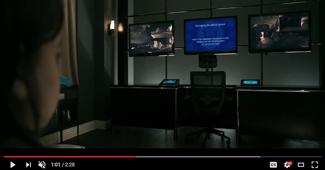
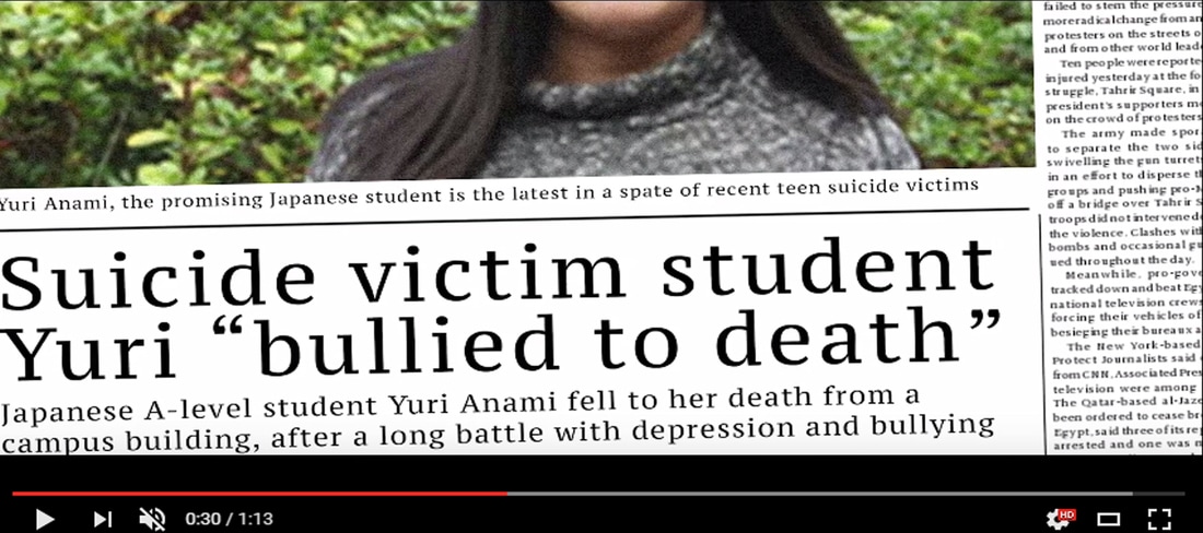
Another thing we had challenged was the use of media. Usually in films they would interrupt TV programs to broadcast important information to everyone in the city, so we challenged this by putting the article about Yuri in the local newspaper. We believe this would be more effective seeing as people would read the newspaper more eg. parents, and they will past this information on to their kids who attended the same school as Yuri, adding to the storyline.
Jump Scares
We decided to challenge where we wanted to put our jump scare. This is because they are usually inbetween scenes in the middle of trailers in order to keep the audience watching. However we put our jump scare at the end because it is somewhere the audience wouldn't expect it to be and it would surprise them, making them wonder if we would have any other jump scares in random places of our film.
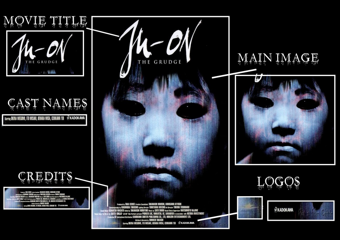
Sub-genre:
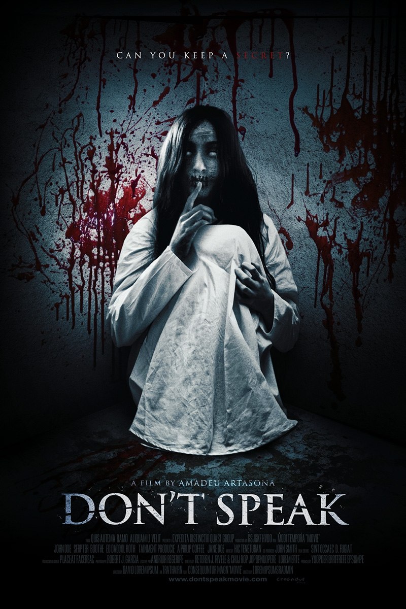
Costume
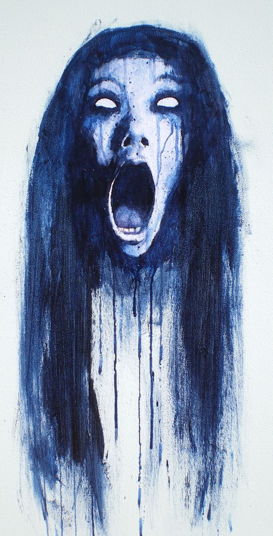
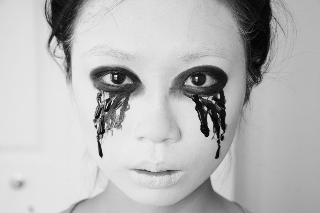
|
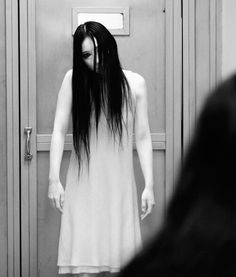
|
In J-Horror a common style of costume is someone wearing a white (colour of purity) kimono that most Japanese take their final journey in, which is called a kyokatabira, black eyes and long hair. Seeing as this is the standard costume we decided to interpret this and make our main character Yuri wear the same thing, as you will see above in our trailer. We also did this because it will make it easier for the audience to tell that she has passed and was carrying out her motives through Mei after she had possessed her.
