Friday The 13th
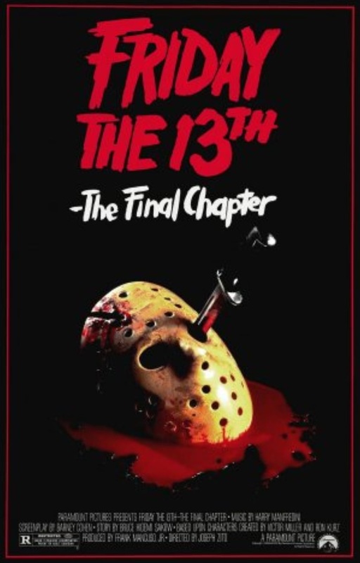
Title: Friday The 13th.
Release date: April 13th 1984.
Director: Joseph Zito.
Film information: Last of the Friday the 13th film series
Synopsis: After being mortally wounded and taken to the morgue, murderer Jason Voorhees spontaneously revives and embarks on a killing spree as he makes his way back to his home at Camp Crystal Lake.
Production / finance company: Paramount Pictures (presents), Georgetown Productions Inc. and Sean S. Cunningham Films
Principle cast: Corey Feldman, Ted White, Kimberly Beck, and Crispin Glover.
Sub-genre: Slasher.
Mis-en-scene: The use of Jason’s mask being displayed on the front cover makes the image relate to the tag line “The final chapter” because it would make the audience think if he has finally been defeated, seeing as this is the last film. The use of blood as a prop and a knife going through where his eyes would go could symbolize the type of violence that is going to be in the film. The use of red in the film title connotes death, because in most cases the antagonist is targeting the protagonists trying to kill them off and leaving them helpless, this could also signify that the antagonist believes he is more stronger than the antagonists, hence why the title is above his mask which is in a pool of blood to show he has more power. There is some lighting coming from the bottom right of the poster would could symbolise that all darkness comes to light as Jason gets his revenge.
Typography: The font used is a standard bold font coloured in red, and some of the letters eg. The “F” and the “I” have little flicks / lines on the letters which could connote that this is a slasher type film because Jason slashes one of the teenagers.
Mood and styling: The use of only black, red and white in this poster creates a dark atmosphere that would run throughout the movie. The blood and knife would also create the impression that a lot of violence is going to occur in the film.
Target audience: Due to this film being rated R, I believe it would mainly be adolescents, people who are fans of horror and the Friday the 13th series who would mainly be interested in watching this film.
Scream 4
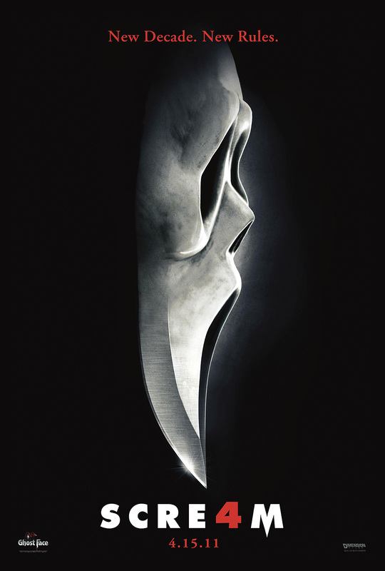
Title: Scream 4.
Release date: April 15th 2011.
Director: Wes Craven.
Film information: The last film in its series of sequels.
Synopsis: A woman trying to promote her self-defense book, and on the return to Woodsbro she finds herself sparking the return of ghost face putting everyone she loves in danger.
Production / finance company: Dimension Films & Corvus Corax Productions.
Principle cast: Emma Roberts, Sidney Prescott, Kirby Reed, Gale weathers and Dwight Riley.
Sub-genre: Slasher.
Denotation: The mask in the poster is shaped as a knife a deemed to be sharp, this connects that the antagonist in this film may act with precision and be lethal at all possible opportunities. The black background also has links to darkness and evils he has inside him, which could convey that the killer is acting on this due to a “dark” i.e. harsh or traumatic experience.
Mis-en-scene: The lighting in this image is used to focus the image on the subjects face and not project any of his/her other features. This could connote that the antagonist is stealthy in his actions or could mean that he like to stay hidden before he strikes his victims. The NVC of the subject is hidden by their mask which could show convey that the subject doesn’t like to show their emotions which is why they went into the life of crime & murder. This is also significant as it shows the antagonist in the Slasher genre are normal people who have had something happen to them however hid it and result to murder instead.
The setting is completely black out and all we have is a black background to refer to, this could connote that the subject kidnaps his victims and takes them to unknown locations before taking their lives which is significant because kidnapping / abductions are big conventions of the slasher genre and shows that the subject may have exterior motives besides slaughtering his victims. The Costume of the subject shows him wearing a mask, which is significant to the slasher genre, as most antagonist do this to hide their identities and protects them from law enforcement's after they have committed their murders. The only prop that can be related to this poster is the knife which is shown by the mask, although the subject is not directly holding one with this it is easy to tell that this would be the subject signature weapon. This has conventions to the slasher genre as most of the antagonists are seen to have weapons with phallic connotations and this would support that also leading the audience to assume that the subject behind the mask is male.
Typography: the typography used is relatively modern however it’s also smart. The title scream has been positioned right under the knife/mask which connotes that being buried under, the a is replaced with a ‘4’ for the word scream which illustrates that this is the 4th film in the series, the both the “A” and the release date have been written in red which has direct connotations to blood which synchronizes with the horror theme which is slasher.
Target Audience: Due to the content of the film and its graphic nature the film would be aimed mainly at 18-24yr olds.
Drag Me To Hell
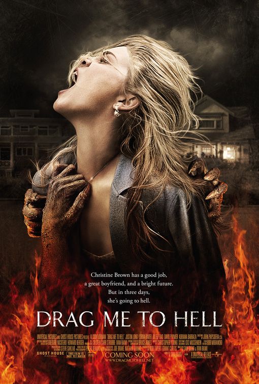
Title: Drag Me To Hell.
Release date: May 27th 2009.
Director: Sam Raimi.
Film information: There is a sequel to this film.
Synopsis: A loan officer who evicts an old woman from her home finds herself the recipient of a supernatural curse. Desperate, she turns to a seer to try and save her soul, while evil forces work to push her to a breaking point.
Production / finance company: Ghost House Pictures, Mandate Films LLC, Buckaroo Entertainment.
Principle cast: Alison Lohman, Justin Long, Lorna Raver, Dileep Rao, David Paymer, and Adriana Barraza.
Sub-genre: Thriller.
Denotation: This movie poster consists of a mid-shot of the main actress Alison Lohman, covering three quarters of the entire poster, where she is seen screaming and being dragged by an indistinguishable creature. In addition to this the last third of the poster is covered by an image of fire. The white title of the movie is also on the last third of the poster which consists of large capitals of the name “Drag me to hell”. The tag line of the movie is directly above the title of the movie which also has white font. The credits of the movie is positioned at the bottom of the poster and is an orange color. The credits contain things such as the distributors, director in addition to the cast of the movie. Also in the back ground of the poster are two houses.
Mis-en-scene: The poster itself is quite desaturated, which could imply the earth as being neutral, however the last third of the poster shows orange-red fire. The ‘orange-red’ connotes danger which correlates to the film itself as it’s ‘drag me to hell’ and hell is place that is seen as dangerous. The two contrasting colors accentuates the difference between neutral earth and ferocity of hell. The main actresses NVC (Non-verbal communication) is showing her to be screaming. This could indicate that she is in pain or the fact that she is scared. This may engage the audience to want to see the film due to the fact that they would want to know the reason as to why she is screaming especially with the addition of creature looking arms are dragging her. Also, the use of the creature’s arms, without showing the face could entice the audience as it brings about their ‘fear of the unknown’. In the background there are two large houses which are conventional in horror movies due to the fact that there are usually many rooms thus more space for the unknown to roam.
Typography: The title of the poster is made up of bold, (the font closely looking like ‘Calibri’) in order for the audience to be aware of the title of the film. The color of the title is white, which is often associated with horror films due to the fact that it conveys a pureness to the film which is essentially a juxtaposition as in supernatural films in general a religious essence is added to the film. Also, within the title the word ‘hell’ is used and the connotations of the color white is a difference to the meaning of the word. In addition to this the white color is used due to the fact that it needs to stand out as the other colors used are quite bold and dark. The tagline of the poster is quite matter of fact which could encourage people to watch the film due to the fact that people would be curious as to either why she is going to hell or whether it would actually happen. The credits have a small font due to the fact the it doesn’t really important information, however the date of the film has an increased font as that information is important as it indicates when the film is coming out. The simplicity of the font used is to not take attention away from the main image.
Target Audience: Considering the points above, the target audience of this film are for those aged 15 to 30 who enjoy spiritualistic/supernatural films as the title itself conveys a religious theme (hell). Furthermore, this could appeal to the male audience due to the fact that it shows an image of a women that is seen a vulnerable and helpless which could satisfy those with the ‘male gaze’.
The Omen

Title: The Omen
Sub – Genre: Supernatural
Year of Release: 2006
Director: John Moore
Production/Financing Company: 20th Century Fox
Principle Cast: Julia Stiles. Liev Schreiber, Mia Farrow, David Thewlis, Pete Postlethwaite, Michael Gambon, Seamus Davey-Fitzpatrick
Films Origin/Info: The film was originally made in 1976 by British/American director Richard Donner. The 2006 version is a remake.
Synopsis: Robert and Katherine Thorn seem to have it all. They are happily married and he is the US Ambassador to Great Britain, but they want nothing more than to have children. Robert is approached by a priest at the hospital who suggests that they take a healthy newborn child whose mother had died in childbirth. Without telling his wife he agrees. After relocating to London, strange events lead him to believe that the child he took from the Italian hospital is evil incarnate.
Mies-En-Scene: A combination of bright and dark lighting has been used for this movie poster. For the subject of the poster who is the character Damien, the lighting around him is obscure connoting the evil he holds. However, the Rottweiler behind him as well as the background of the poster is brightly lit. This suggests that even things associated with evil like a Rottweiler and a chilling forest, are no match for the evilness of Damien. Even though Damien’s face is not fully shown clearly we can see his facial expression. He is staring straight into the camera with a straight face. Children usually show an expression or some emotion, however Damien’s facial expression reinforces the fact that he is not a normal child or even human. Furthermore is in a sitting position, as if he was ordered to. This could imply the authority Damien has due to being the Anti-Christ symbolizing how he may have power in the film. The poster is set in a forest which is foggy and eerie, which seems to be an isolated area which conveys it’s possibly deep in the woods. Leaves are displayed on the ground which could imply that it is autumn/winter possibly around Halloween time in October. The trees have no leaves which is significant because it could connote death, they are now on the forest floor rotting. Damien caused so many deaths in the film that he is so powerful nature is even getting affected. Damien is wearing a black coat boots and it makes it clear in the poster that he is wearing blue gloves. The blue gloves connote the innocent childlike persona in him, because children like bright colors, so this indicates that children who look innocent and harmless could be a threat. The prop of Damien on the swing is important because it shows the swing in motion so he is playing on it. Allowing us to understand that he can conceal his sinister intentions by acting like a normal child on a swing though his farcical expression says otherwise. Another prop is the Rottweiler behind Damien it looks like he is almost guarding Damien which is quite ironic because children are usually guarded or looked after parents or their guardians but Damien has a dog which could convey his childlike persona because children find friendship in animals. The Rottweiler is also a strong dog which could be a physical reminder to the audience that no harm can come to Damien.
Camera Angles: The camera angle is at eye level, however, due to Damien being on a moving swing which is in mid-air, he seems to be at a higher angle, this could connote his superiority because of his supernatural powers.
Shot Size: The shot size used is a long shot as it includes setting of the poster and the full body of the subject and the Rottweiler in the background. The purpose of using this shot is to fortify the nature of Damien and give the audience small insight into the degree of Damien’s evil.
Typography: The typography is an old-fashioned, Gothic style font and could be associated with the theme of prophecies and the Bible which is an ancient text. Moreover, the title is in upper case, bold letters making it eye-catching. The typography of the title is hazy, making it hard to look at but still able to read.
Tagline: Above Damien, there is a caption which reads “The prophecy is clear. The signs are unmistakable. On the 6th day of the 6th month in the year 2006 his day will come.” The tagline is quite vague however the reference to the number “666” indicates supernatural and religious themes.
Color: The cold and dull colors such as grays, blacks and blues have been used for the poster. They are very dark and ominous indicating the tone of the film will be morbid. However, white which is a vast contrast to the dominant dark colors is also located in the poster. Which could suggest Damien’s innocence which is slowly fading away as his power and knowledge of who he is grows.
Conventions: Common conventions of a horror movie poster include distorted text, an image that fills the entire poster, dark lighting and colors, bold title, mysterious taglines, release date and institutional information which is all present on this movie poster.
Mood: The mood of the poster is depressing, dark, cold and sinister. This is evident from the cold look Damien has on his face as well as the use of the cold colors.
Credits: At the bottom of the poster are the credits and the movie’s release date. The institutional information is a customary part of any movie poster. The release date is very significant as the number “666” is playing a big role is attracting people due to its religious connections. This has been used to the advantage of the film as audiences are intrigued by the mystery and the thrill of watching a movie that is so heavily influenced by this.
Target audience: The target audience for this film is 15+.
