In this stage, we will be producing "Real Media Texts" which highlight things we find appealing in existing horror genre posters and magazines, this is useful because it will help us when we do our own poster and magazine covers because we would know which certain things to include in order to make them eye catching. We will also be doing "drawn and digital drafts" in this section of our final pieces, once they have been hand-drawn we will then produce our final digital drafts on Photoshop in order to add more detail. This will help us to see each stage of our work and where we have improved.
Real Media Texts
In this task we had to look at existing film posters and magazines and annotate what we liked about these. This task is very beneficial because it helps us see from a different point of view things we should include in our own projects so that when people look at our poster & magazine, they can straight away point out things they like about it.
Film Posters:
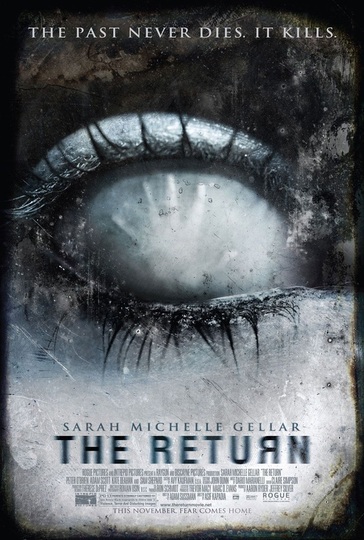
The main thing we liked about this film poster is the fact that it gives off a chill cold vibe the moment you look at it, The use of a close up of the eye draws the audience in more because it would make them want to look closer to see what is inside the eye, the use of the colour blue in different shades connotes ice which could signify that someone is frozen inside the eye and they cannot get out. Also, we liked the font of the poster because it is almost blurry which relates to the icy feeling throughout the front of the movie poster.
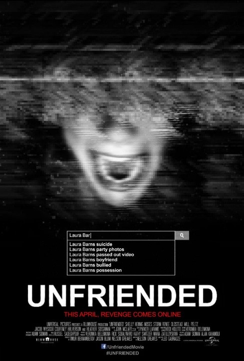
The use of a search bar at the bottom of this poster is one of the main things we liked, this is because it would help relate to the title of the film because on the internet there are different social media platforms where you can unfriend people, so the search bar adds emphasis and would make the audience want to know what was searched, The distorted image connotes a sense of danger, because seeing as this film is from a teenager sitting at a laptop point of view, it is as if we are looking at her but due to the screen becoming distorted, we cannot see her. This would make the audience wonder what happened and if she was hacked.
|
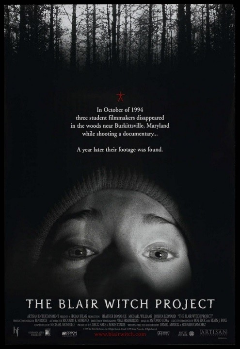
One thing we liked about this movie poster was the caption, this is because it gives away a sense of what the film is about very briefly, and would straight away make the audience want to know what was on the footage that was found. This gives the audience an idea that this would be a personal documented film which is different from most horror films. Another thing we also liked was the image used at the front, the use of this close up makes the audience aware that this film would mainly be first person point of view, making the experience even more exciting.
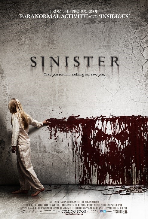
The main thing we all liked about this film poster is the use of blood towards the bottom of the poster and how it has created an image as the girl runs her fingers along the wall. This could also relate to the tagline “once you see him, nothing can save you” because it would automatically make the audience question what this film is about, and what does the face on the wall mean and who it is. The font used for the title of the film also relates to this image because at the bottom of each letter it looks as if it is dripping down and there is also a back shadow, this would create a sense of mystery.
|
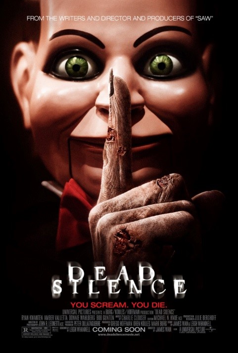
One thing that straight away caught all of our eyes was the main image on this film poster. This close up shot of someone wearing a mask already connotes that they are trying to hide their identity. However the hand in contrast to the mask is very different because the hand looks old, we believed this related to the film title and tagline because the audience doesn’t know who is behind the mask, and if this mysterious person was to come out of nowhere and someone screamed, they would die so they have to be “dead silent”. We believed this would make the audience be interested in the film because they would want to know how everyone survived and if anyone was killed off.
Magazine covers:
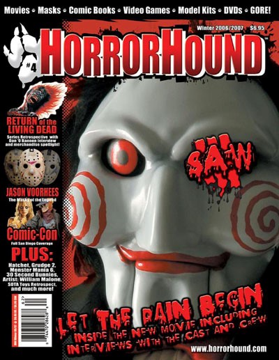
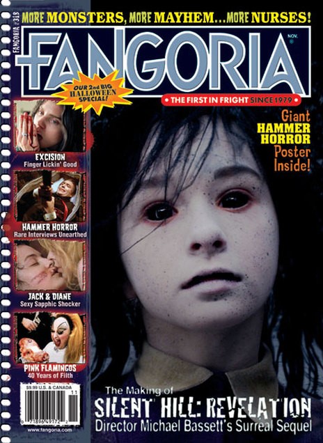
One thing we liked about this magazine cover is the use of props, this is because various different props that are commonly used in horror films are all displayed e.g. chainsaw and knifes. This magazine would appeal to various people who enjoy different horror films based off the sub-genre, so they would all have something to read. Another thing we noticed that we liked was the use of blood being splattered in different sections of the magazine front cover, this creates a sense of danger, which is a common feeling in horror.
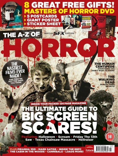
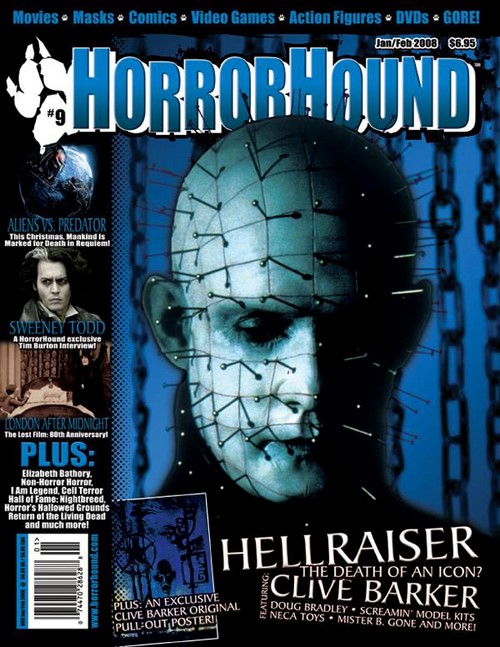
One thing we all liked about this magazine cover was the colour scheme. The use of black, white and red creates the feel of danger and mystery. Another thing that we picked up on that we liked was the fact that the main image is a masked person, and to the left is Jason’s mask, this makes the readers aware that a common prop used in horror are masks because the antagonist wishes to hide their identity when they approach people. This may make the audience think that their identity may be revealed in this magazine issue.
|
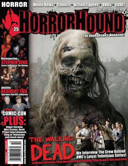
The main aspect of this magazine that we liked was the use of the main image. Through this mid-shot we can tell that this is from a zombie movie due to some of the face being cut open to the point where we can see their teeth / gums. Another thing that relates to this mid-shot is in the background there is a group of zombies standing behind, this would make the readers think some sort of zombie takeover is going to happen. The use of the opacity being taken down doesn’t distract the readers from the main image, but the background is still very visible.
Seeing as we are doing a J-Horror, we liked this magazine primarily because of the close up picture. We liked this because she looks quite pale, has long hair and has black eyes which are common features in J-Horror. The main character does seem to look young so this would attract readers into reading about this film in order to find out what happens. In relation to this, there is also a consistent colour scheme running through this magazine to match the image. This creates an eerie icy type of feeling due to the different shades of blue used.
|
The main part of this magazine that we found most interesting was the main image. Straight away we wondered if this was someone wearing a mask or not. This would attract readers and catch their eye almost immediately because they would want to know what is the story behind this picture and what is the meaning of it. The fact that there are chains in the background would also make the reader question where this picture was taken, and if this person is mentally stable. This would be a different approach to horror and would attract more readers. Another thing we liked about this was that there is a blue, white and black colour scheme running through this magazine front cover.
Drawn Drafts
In this task we had to hand draw what we would like our projects to look like, this was helpful to us because before attempting to do a layout straight away on photoshop, we have a sense of what we would like the layout to look like in order to get it more accurate and save time. Although the layout is subjected to change, these are the main ones we came up with.
|
|
|
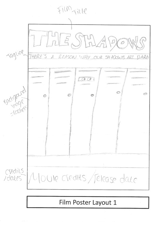
1. The first drawn draft we done is one we particularly liked due to the background setting relating to the film trailer we are going to do due to it being set in a high school. By having the background picture of a row of lockers (there would also be the main character in the middle picking up her books, and the shadow behind watching) it would give the audience of what theme this movie is going to go in.
|
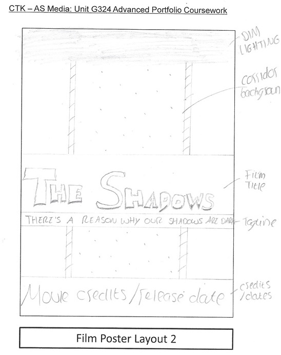
2. Within this drawn draft instead of showing the lockers, we was going to have a background picture of a long corridor while the main character is walking down the dimly lit path. We thought this would add mystery to the trailer because you can't see the main characters face, only the back of them so it would make the audience wonder what they look like and what's happening.
|
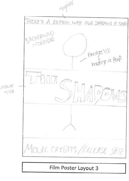
3. With this drawn draft, we decided to just have the antagonist pose at the front of the poster preferably holding a prop in the corridor. This would be useful because it would make the audience wonder why they are holding a prop such as a knife in a school corridor, and what the film is going to be about. This layout also helps people to see the trailer info more clearly e.g.. the release date.
|
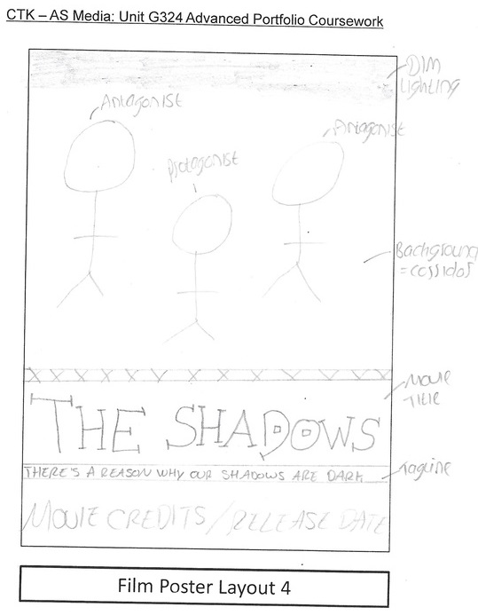
4. In this drawn draft we decided on having three of the main characters on the front of our poster, this is because when the audience goes to watch the trailer they would straight away recognise these three as the main characters, seeing as they will all be holding different props, it adds suspense as the audience would think what is happening between them and how it relates to the trailer title.
|
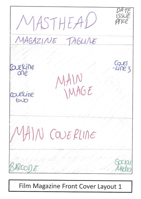
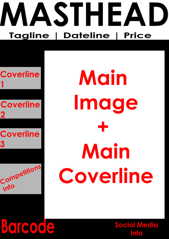
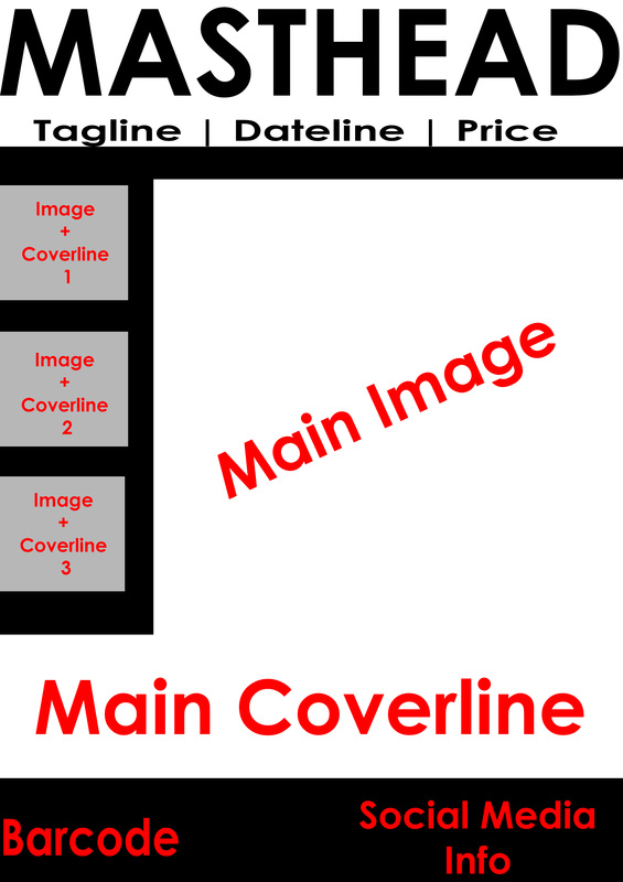
1. This is the first magazine cover we done, this is a very basic one which makes it clear to see where we would display the main image and coverline which would be to do with our trailer, then we would have other coverlines around to attract the readers. We decided to do it like this because it looks eye-catching and suitable.
|
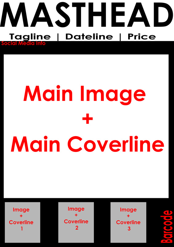
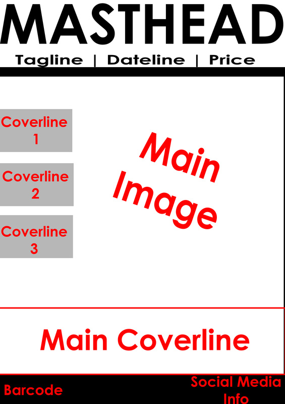
2. In this magazine draft we decided on putting the sub coverlines and images at the bottom of the magazine so that it doesn't distract the readers from the main aspect of the magazine which is to do with our trailer and will make them notice that first, but it will still be eye catching for them and noticeable.
|
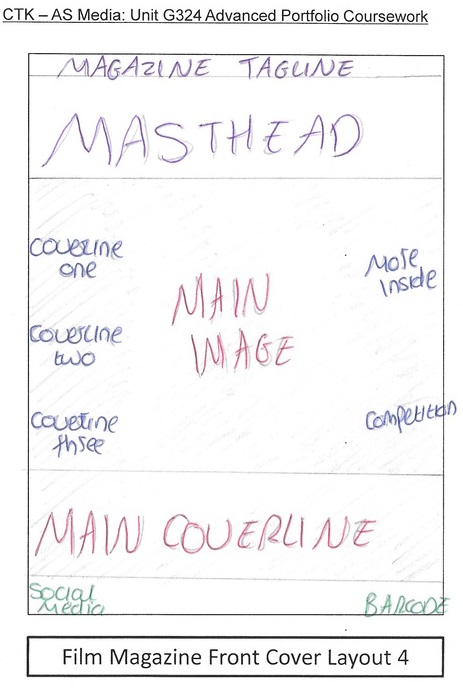
3. With this draft we decided on putting the sub coverlines on the side of the magazine and they would be inside a movie reel strip. We decided to do this to give our magazine a more film look and seem more eye catching. Also, it helps the readers realise which ones are the sub coverlines and which one is the main coverline.
|
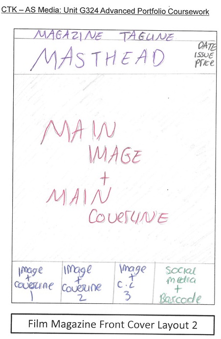
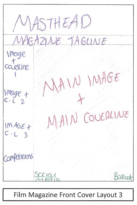
4. We done this draft in a way that the tagline is on top of the masthead this time and also there will be a competitions section, we added this in because it makes the audience be more interactive with our magazine because it would make them want to read the magazine and enter into our competitions
|
Digital Drafts
Similar to the drawn drafts, we have attempted 4 different layouts all made on photoshop for our poster and magazine, although some of them may be very vague, we found that it was easier to see it this way incase of any last minute changed we would like to make, and it will be easier to picture certain things somewhere else.
Poster:
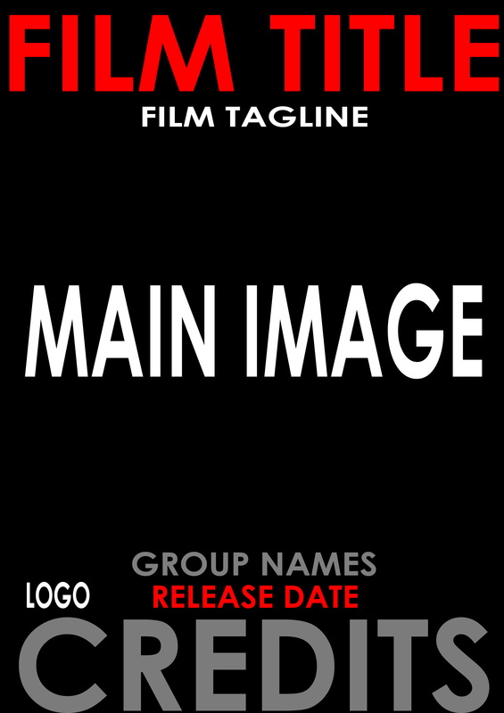
1. This is our first layout for our digital draft of a poster, this is one we liked because everything is set out suitably and you can clearly tell what goes where, this has already given us an idea of where to put certain things and the type of shot we could use for our main image.
3. Likewise with this one, we have the title going across the main picture, whereas this time we have put the film tagline on top of the poster, we have placed it there because if they are in a dimly lit corridor, it would add more suspense seeing as it is to do with your shadows.
|
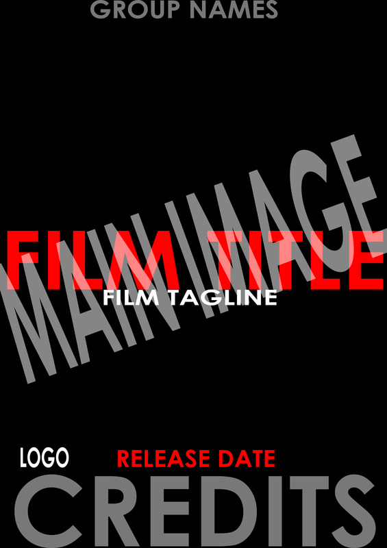
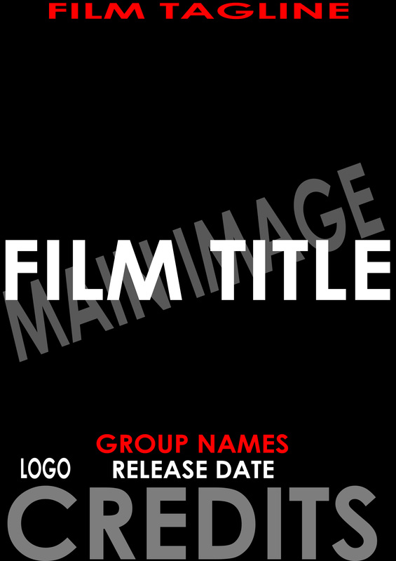
2. This draft is similar to our 3rd and 4th drawn draft where the film title goes across the main image, we believe this idea would really work with the corridor and one character layouts because it would fit in without taking the attention away from the background picture.
4. With this draft we have put the film title and tagline at the bottom of the poster, this was inspired by the Friday the 13th movie poster. We done this because it wouldn't take attention away from the main image which may be a close up of the main character, and it would also be very eye catching.
|
Magazine:
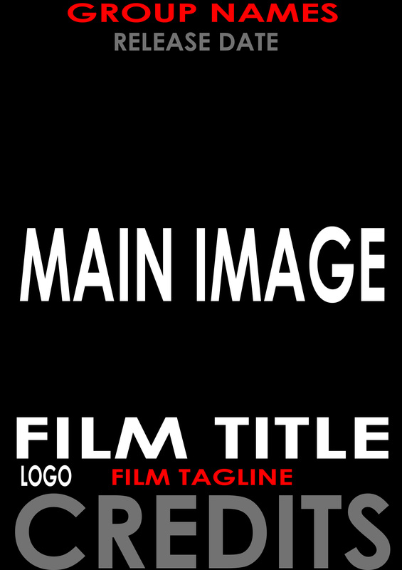
1. This is our first digital draft for our magazine, we have put the sub coverlines and the main coverlines separate so the readers would know where to look first, and to also see which additional features are in this issue as well as the main storyline about our trailer.
3. Similar to our 2nd drawn draft, we have put the sub's at the bottom and the main image + coverline above it so it takes up more space and is more visually appealing for the readers. It also makes our magazine look more structured because everything would be laid out accordingly.
|
2. Likewise with this one, we have done a similar layout however the main cover-line will run across the bottom of the magazine, we have set it out this way because it won't take the attention away from the main image, which in this case would be a close up of our main character.
4. With this digital draft, we have made the main image take up most of the magazine cover, and we would have sub cover-lines on top of the image, but they still won't draw attention away from the main image. We diced to do it this way because it is something different and could potentially work.
|
Typography
This task was primarily exploring Photoshop and seeing how we could layout our projects in more detail. We have done 10 of each and they all have something unique about them, this task was very eye opening because it is more visual and made us think if we chose to do one of these layouts, how would we add certain pictures in to make it fit and look suitable and appealing to the audience.
Poster:
Magazine:
Test Shots
This task is in relation to the typography, because we took some mid and long shots for practice to see how it would fit in with our layouts that we have already made, this is a new task to us but we did find it fun and useful to do due to it making us realise when we do end up doing our final projects, what type of shots, props and lighting we should use and why.


Photos we liked:
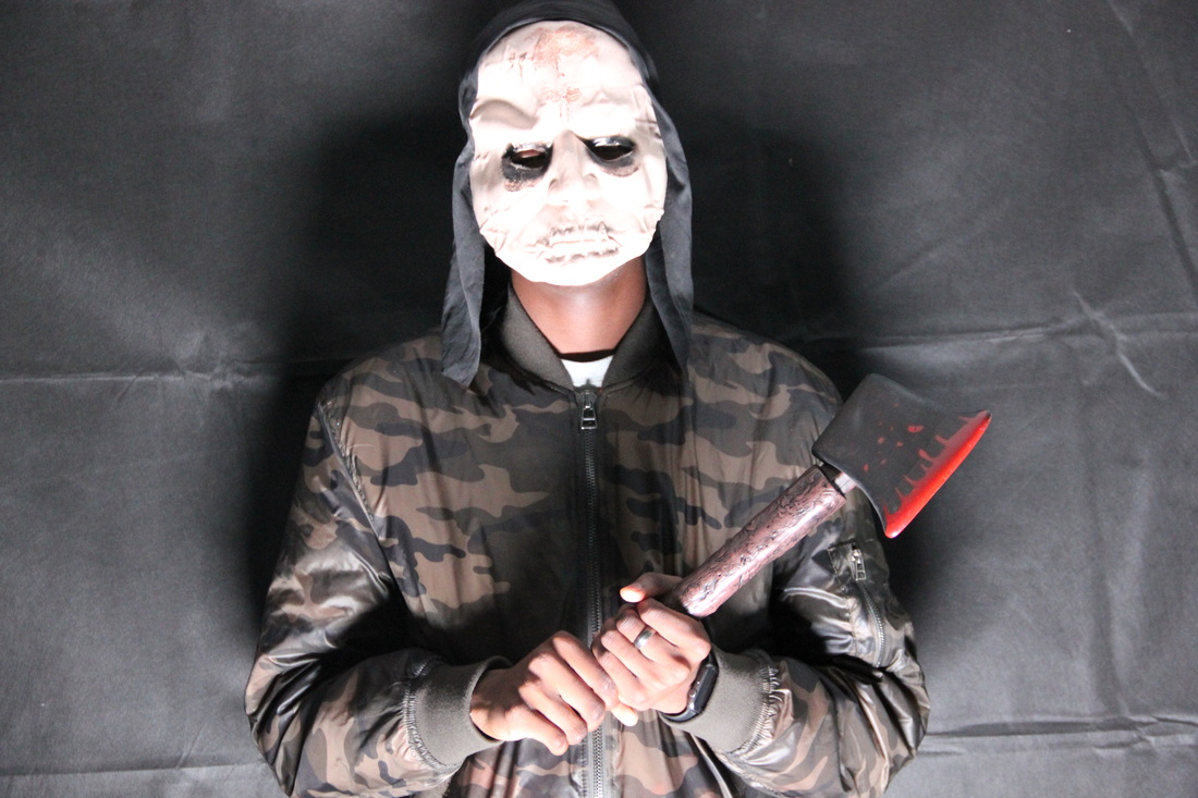
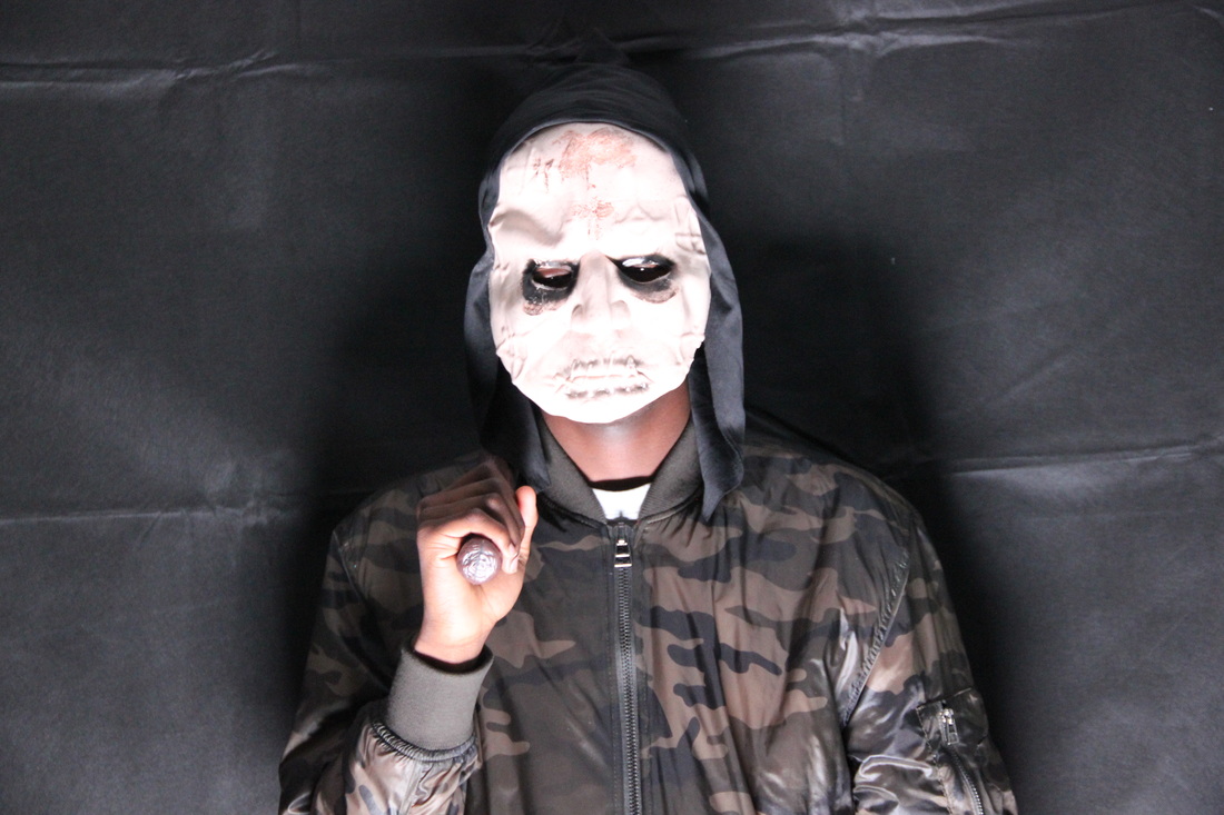
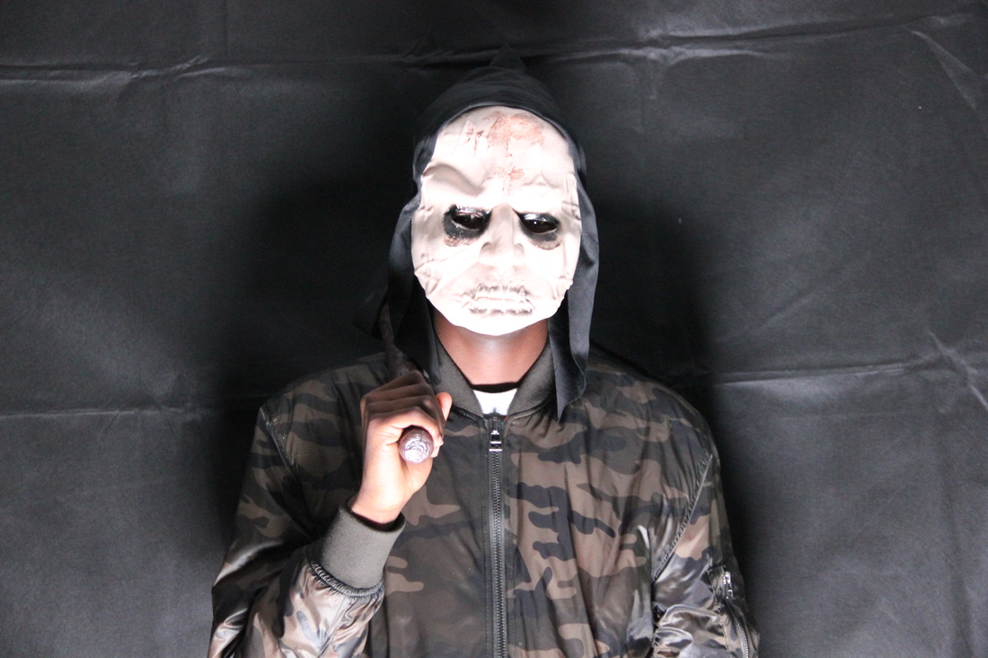
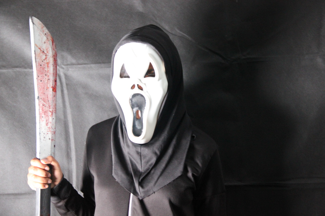
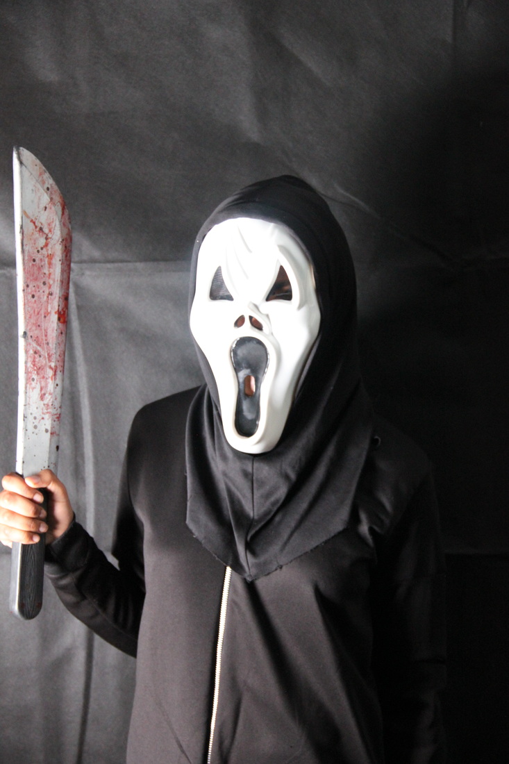
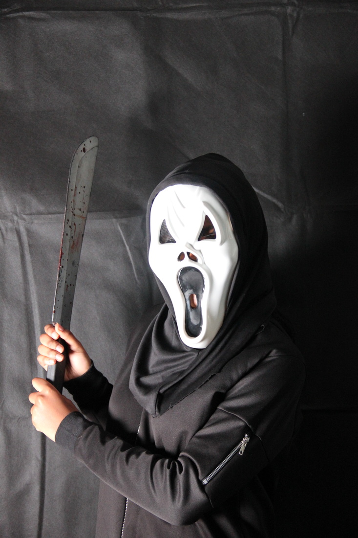
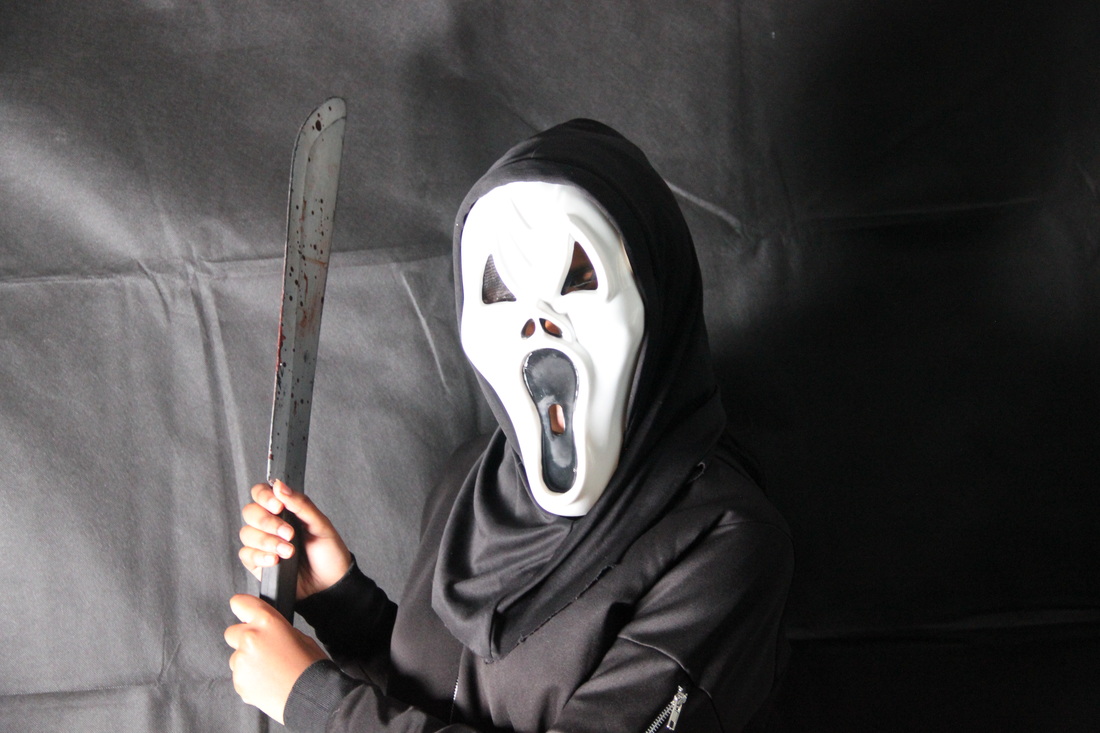
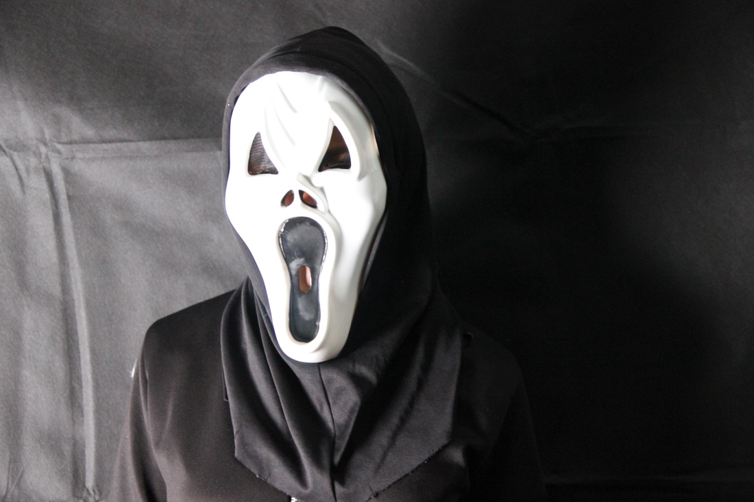
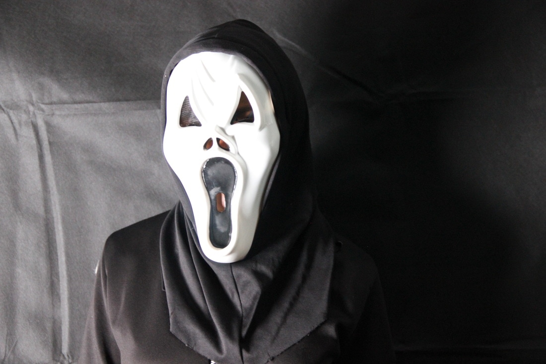
We liked this one due to the pose our character is doing with the prop in his hand. The prop has blood on it which could signify the danger that is going to occur in the trailer, also he is wearing a mask so in addition this adds to it as it would give a sense of mystery from the audience.
|
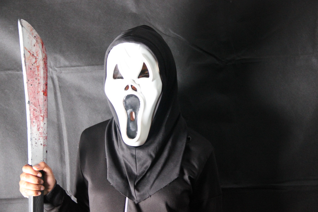
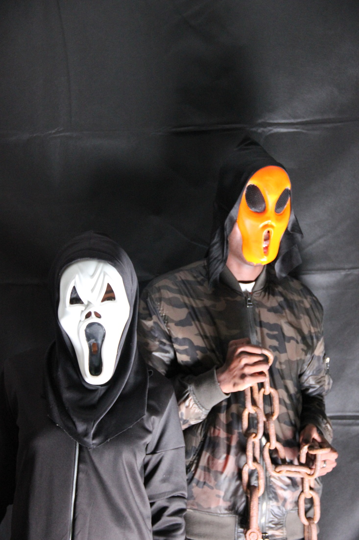
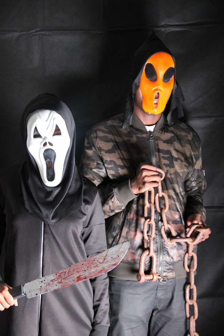
We liked this photo because it has two characters both holding different symbolic things, one character is holding a knife whereas the other is holding a chain, this pose and use of props was inspired by The Purge because they are using weapons while hiding their identity from people.
|
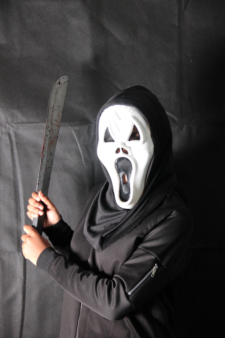
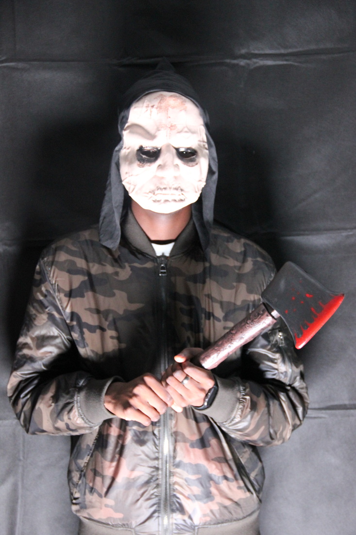
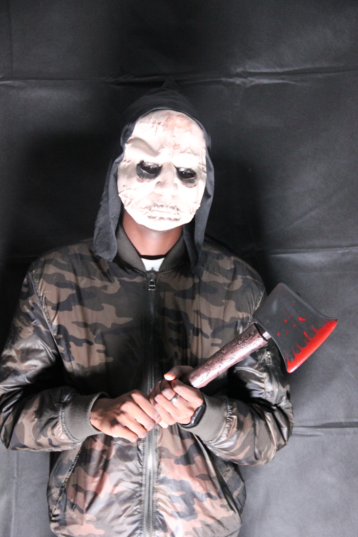
We liked this photo that could potentially work for our magazine front cover for example because of the pose our character is doing, the position of the prop which is a knife with blood on it symbolises that she is ready to attack what is going towards her, making it more engaging.
|
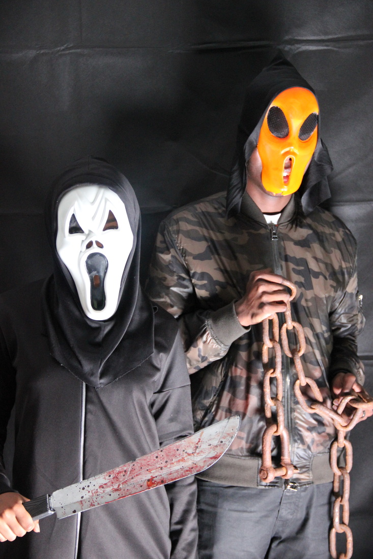
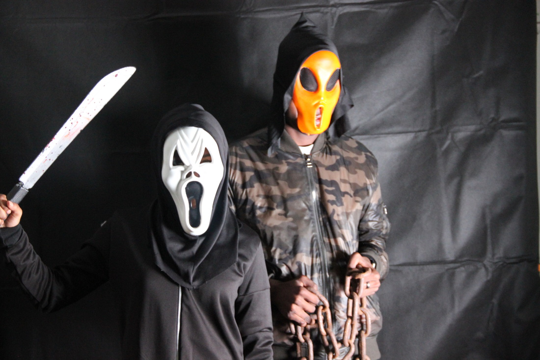
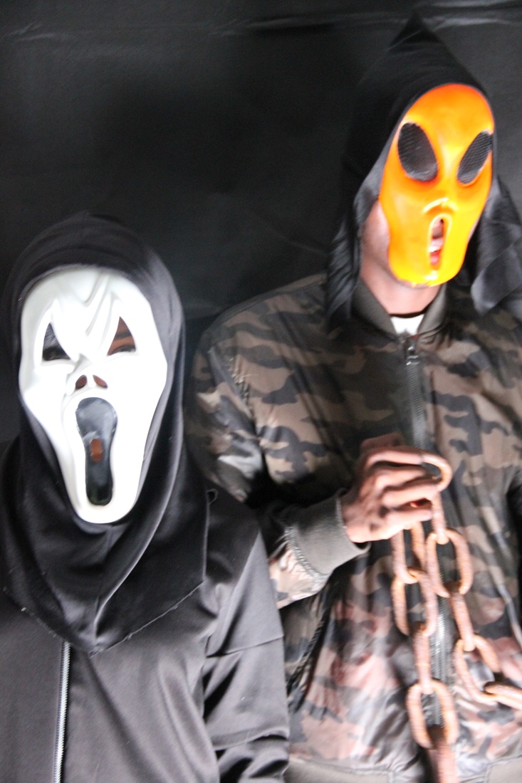
We also liked this photo because it shows off the props more eg. you can see the blood more clearly on the knife and more of what the chain looks like, this would make the audience question what they are being used for and if these two are the protagonists or antagonists in the trailer.
|
Photoes we disliked:
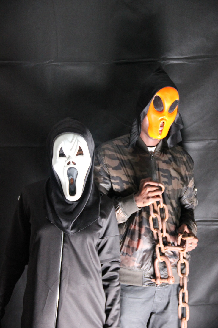
We didn't like this photo due to the lighting, on the left hand side there is more lighting displayed in comparison to the right hand side, this means that we wouldn't be able to use this in our magazine / poster because one side would be brighter and easier to read than the other.
|
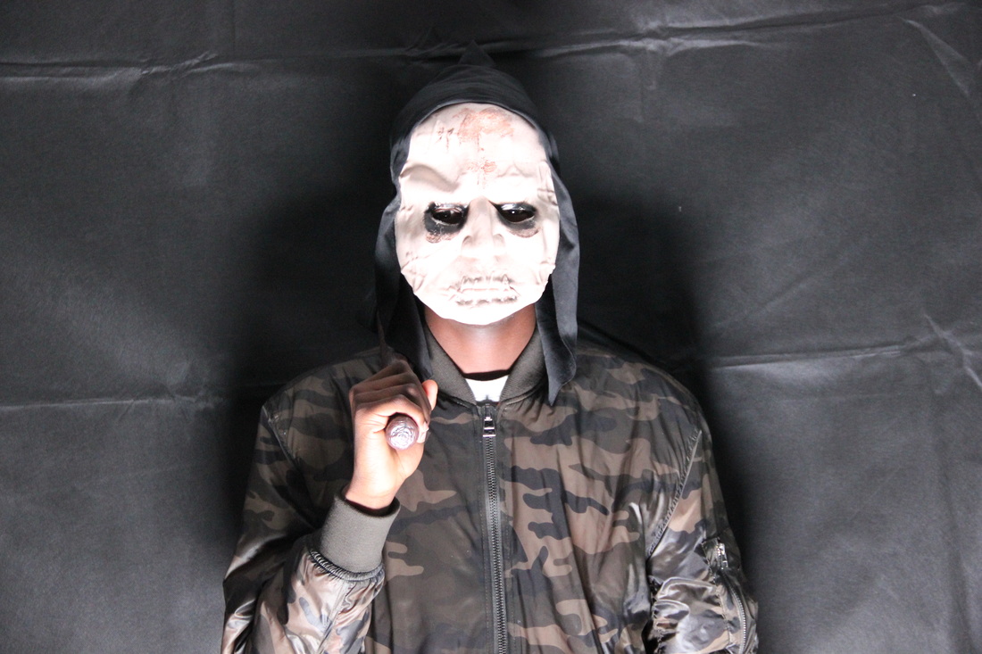
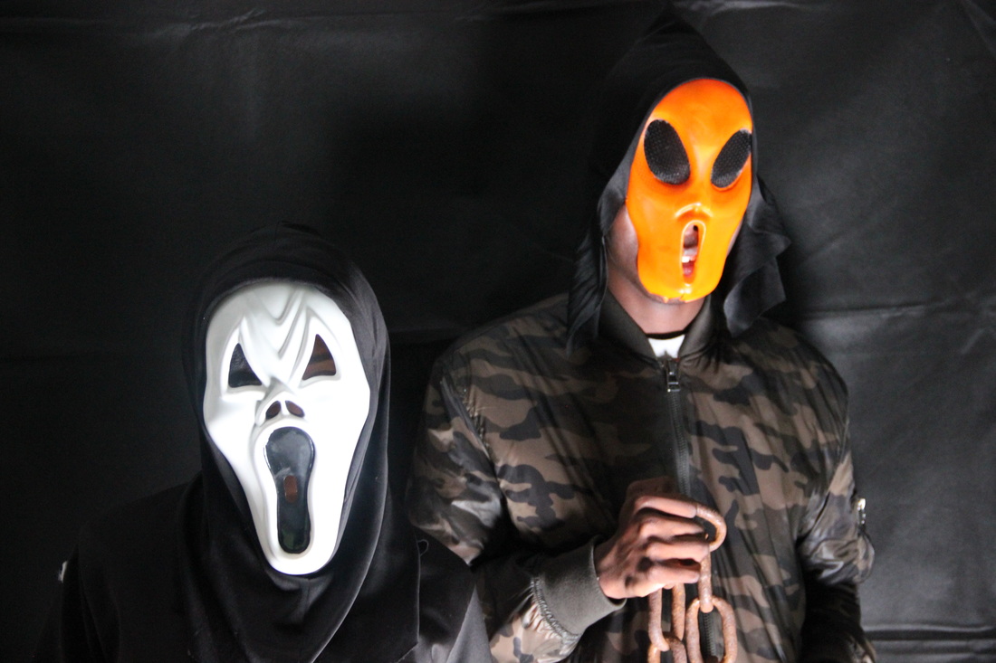
Although this picture was taken with good quality, we wouldn't use this photo due to the fact that the lighting in this picture doesn't show off the prop that is in his hand, so the audience / readers will be confused as to whats in his hand.
|

We disliked this picture due to the fact that our characters were not ready to take this picture, hence why the we are unable to see the prop our character has in her hand on the left. If we was to use this picture, it would make our poster / magazine seem unprofessionally made.
|
We also disliked this picture due to the fact that we cannot see the props our characters have, due to this being a mid shot and our characters are holding their props more towards the ground, it would have been better to do a long shot of this pose instead.
|
