Scream 4 (Scre4m)
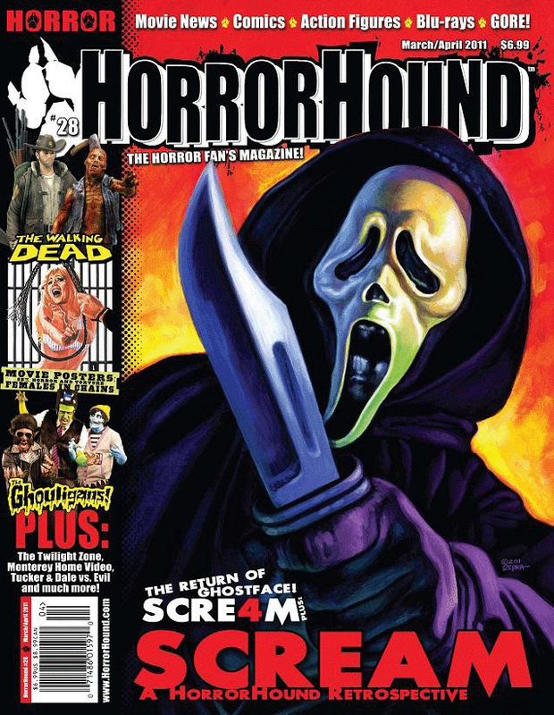
Title: Scream 4 (Scre4m).
Release date: 15th April 2011.
Director: Wes Craven.
Film information: This is the last film of the Scream franchise.
Sub-genre: Slasher.
Mis-en-scene: The main image is a mid-shot of the main character “Ghostface” holding up a knife, while wearing a dark purple robe. This could connote that in order for him to be wealthy he causes harm or kills people and lives off it, the use of animated fire in the background could also relate to what he does, but signifies that he does not feel guilty about it seeing as he isn’t facing the fire, but instead pointing his knife at the audience. There is one main cover line and a comic strip on the left third which would attract the audience due to there being more to read inside the magazine.
Typography: The masthead is very bold and stands out, making it very eye catching for the reader and make them aware of what the title of this magazine is. It is in black and white with a 3D effect to it making it stand out more. The main cover line is in white and red, the use of red could connote blood, violence and death. The yellow on the left side of the magazine where the comic strips are connotes danger, seeing as the use of yellow relates to the color of the fire in the background.
Mood and styling: As previously mentioned, the use of burnt colors, purple and white creates a danger mood in this magazine because the reader doesn’t know what is going to happen, but they would be able to sense lives would be in danger.
Target audience: Due to this magazine cover being animated, I think the target audience for this magazine would be teenagers because it doesn’t seem too realistic. Also, people who are really in to horror would read this magazine because that is what is displayed all throughout the magazine.
A Nightmare On Elm Street
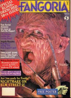
Title: A Nightmare On Elm Street (Fangoria magazine).
Release date: 16th November 1984
Director: Wes Craven
Film information: Was the first film of the Nightmare on Elm street enterprise
Sub-genre: Slasher/Supernatural
Principle Cast: Heather Langenkamp, Johnny Depp, Robert Englund
Production / financing company: New Line Cinema
Denotation: The main image of the magazine is a mid-shot of the main antagonist looking into the camera i.e. the audience, the purpose of this is to show the facial expression of the antagonist and to create fear on the reader reminding them that they are reading a horror magazine. On the left there has also been other smaller images used two of them being mid shot of other slasher antagonists such as Mike Myers these are all to show to the reader the other features which will be present in the rest of the magazine.
Mis-en-scene: The most noticeable thing which can be seen in the image is the subject NVC which appears to be aggressive and connotes fear which clearly shows that the subject is the antagonist, the use of his glove is also significant as it will amplify the fear that the subject is trying to give his viewers.
Typography: The masthead of the magazine is red which could represent blood / danger which is the main action that the subject who is the antagonist of the movie is trying to instigate into the lives of his victims.
Target audience: The target audience for this magazine is those interested in slasher horror films, so it would mainly appeal to teenagers 16+ and horror fans.
The Lords Of Salem
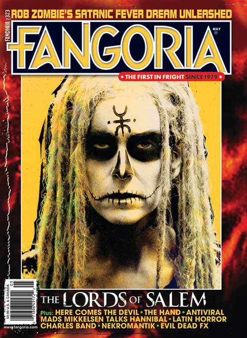
Title: The Lords Of Salem (Fangoria magazine).
Release date: April 19th 2013.
Director: Rob Zombie.
Film information: A 2013 independent film.
Sub-genre: Supernatural.
Principle Cast: Sheri Moon Zombie, Jeff Daniel Phillips, Meg Foster, Bruce Davidson, Dee Wallace.
Production / financing company: Alliance Films, Automatik Entertainment, Blumhouse Productions, Huanted Movies, IM Global
Denotation: The use of black and white face paint connotes death, and straight away makes the audience aware that there will be some factors to do with religion in this film. The symbol on the forehead could connote Christianity and another faith, seeing as half of it seems to be a cross and the other half is a different symbol. Therefore there could be the theme of God vs. everyone else throughout the film.
Mis-en-scene: Lighting is most likely to be used on the magazine cover to highlight and capture the main features of the face paint, for example the symbol on her forehead is clearly shown as well as the style of her hair. The lighting overall makes the image scarier and makes the audience question if every character looks like this. Through the use of a mid-shot we can see her NVC being displayed is serious, but at the same time dangerous seeing as she is making direct eye contact with the camera. The magazine doesn’t specifically have a setting, however there are some patches of red and black in the background of the image which could represent things such as darkness and death, which could then relate back to the reason as to why she has the symbol on her forehead. The face paint could connote evil and death which highlights the religious theme, the long hair also adds an effect to the face paint as it makes it more distorted and eerie as well, the emphasised dark eyes as well as the mouth design adds a more evil element / feel to the face paint. These elements allow the audience to clearly detect who the antagonist is.
Typography: The masthead is in big and bold letters which is very eye catching and allows it to stand out. The masthead of the magazine is in yellow which I think relates to the desert type background which is behind the image. The ‘L; in ‘Lords’ and ’S’ in ‘Salem’ are similar to the weapons used in war at that time, due to the way it is portrayed seeing as some parts of the letters have faded, which connotes this could be a battle that has been going on for a long period of time, this also highlights the aspect of war between good and evil / light and darkness, the whole religious element of horror is well represented within the font of the magazine.
Target audience: Seeing as the front cover seems to be very mild, I believe the target audience for this would be young teenagers around 16+ and people who are big fans of horror as a whole, particularly supernatural horror films.
Hound Horror
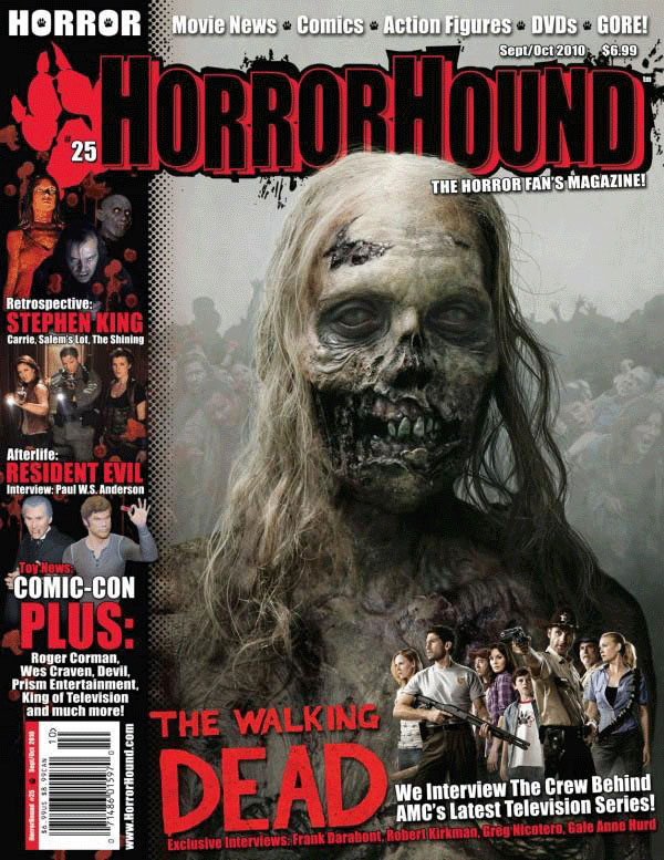
Title: Hound Horror
Release date: 31st October 2010
Director: Frank Darabont
Film information: It was based on a comic book series
Synopsis: The television series is about a group of people trying to survive a zombie apocalypse.
Production/financing company: AMC Studios
Principal cast: Andrew Lincoln, Jon Bernthal and Sarah Wayne Callies
Sub-genre: Zombie/ splatter
Mise-en Scene: The lighting consists of low lighting which contributes to the horror theme. However there are some elements of high key lighting which enhances features such as the zombie character on the main image. Which allows the reader to know that the Zombie is an important character. The main image is of a zombie like character who is giving direct eye contact to the audience which makes the audience feel like they are his next target giving the audience unsettled and unnerving feeling. Non-verbal communication lacks in this magazine as the zombie is portrayed as being dead, so therefore the zombie’s NVC connotes a deceased being. The setting looks like a zombie apocalypse, which is shown in the background the grey smokey color connotes how the setting is run down and broken. The audience only see the skin and hair of the zombie this may perhaps connote how zombies are part dead part alive so they still have a few features of an live human. No props displayed, however in one of the sub images next to the main coverline, some guns held by a non-zombie / non infected human. The use of guns as a prop connotes the vulnerability of humans in a zombie apocalypse and the importance of protection.
Camera framing and shots: The horror hound magazine subsists of mid-shots. This is effective in portraying costume and NVC to the audience. On example to this is the main image where the zombie’s NVC is portrayed as being lifeless yet the costume on the zombie is portrayed through the use of make-up where the audience sees the flesh on the zombie disintegrating.
Text and typography: The majority of the font is in sans serif and is displayed throughout the front page of the magazine. The use of the sans serif font connotes a modern feel towards the audience therefore portraying the magazine as being up to date with current events. Which would influence buyers to by it from first glance.
Color: There is a limited palette for colors featured on the front page, red, black and white. The colors red and black both connote blood and death. Theses colors are perfect for a horror themed magazine as blood and death are common themes in the horror genre. The white connotes the antagonist in horror genre the innocence and purity they hold.
Masthead: The masthead of the horror hound magazine is displayed at the top of the front page. It also consists of the colors red and black which connote the themes of blood and death. By using these colors in the masthead, it allows the audience to have an idea of what the magazine could be about or the theme of the magazine. The masthead it situated at the top of the front page, this is so that it does not disturb the main image which allows buyers to notice the magazine clearly.
Coverlines: The main coverline on the horror hound magazine is “The Walking Dead”. It is placed at the bottom of the front page; this is so that it does not disturb the main image at the top. It is also in the color red in a sans serif font. The color red connotes blood and relates to the horror theme of the magazine. The use of the sans serif font suggests that the magazine is up to date with current events. This gives the audience a sense that the TV series “The Walking Dead” is something new and suggests the audience to go and watch it so therefore publicizing "The Walking Dead" as well as the magazine which would be more eye catching to buyers
Selling Line: The selling line for horror hound magazine is “THE HORROR FAN'S MAGAZINE”. The use of the word Fan’s suggests that all lover or fans of the horror genre should own or read this magazine, and if they don’t have one they are missing out. Like many selling lines, it is situated just below the masthead; this is so that the readers sees both the name of the magazine (masthead) and the selling line plus make a connection between them.
